 Here's a little preview of what L&G will be showing for the Friday Ctrl+Alt+Design Show.
This was taken with a Polaroid camera. I just really like how this photo turned out...
Gotta love Polaroids!
Viewing entries in
Design Related
 Here's a little preview of what L&G will be showing for the Friday Ctrl+Alt+Design Show.
This was taken with a Polaroid camera. I just really like how this photo turned out...
Gotta love Polaroids!
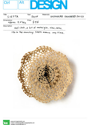 JOIN us for a celebration of 26+ fantastic designs from Seattle and across the states! Our next show, Ctrl+Alt+DESIGN will be opening on FRIDAY, JUNE, 12th from 7pm-Midnight.
Ouch My Eye Gallery is sponsoring the event by letting us use their awesome studio/gallery space with a bar and a new Cafe, Occhio. (Pronounced OH-KEE-OH) This show is gonna be EPIC!! This is our first juried design show, and we were thrilled with the quality of work and design from the submissions.
There's a great selection of designers and design work from small accessories, jewelery, home decor, lighting, to furniture.
There will be music, all the designers and artists will be there, art installation by (knee shy), all of the BRITE lites, AND a one day only event at reception: Bread Friend Map by Tricia Martin. All I'm gonna say is, YOU+(2 x FOUR FOOT long loafs of bread)=AWESOME FRIEND MAP. If you wanna find out what all this is about, you just gotta come and check it out!! Here's a process shot of the homemade mega bread from Tricia....crazy. Dylan and I are gonna have some smaller L&G designs there as well! ...Meet Mr. Rhino. Pleasure.
 See you there!
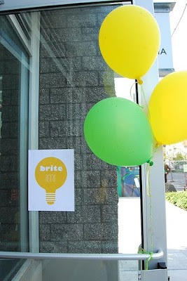 Hello! We apologize for the delay!! We held our first BRITE event on May, 16. We FINALLY went through the photos (I took 400+ photos!) and can now share with everyone what a fun event it was!
 For this first event: BRITE lite, LOCAL DESIGNERS & CRAFTERS teamed up to participate in a spontaneous 4 hour community scavenger hunt/design-build to create ready-made lamps from household and second hand materials.
 There was a good turn out with 18 people (total of 9 teams) who participated that day. We asked people to bring materials to share with everyone and there were a great mix of lamps that came from it. We gave every team a BRITE lite kit...which I had a little too much fun with. :D
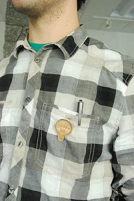 Everyone also got a special wooden BRITE badge! Our plan is to do that for every event! ...I mean , who wouldn't want to be rewarded for such accomplishments! A simple badge is a perfect item that says "HEY! I accomplished something today and that's a wonderful feeling! (blank stare and a giant stiff smile)" And THAT's pretty darn special, wouldn't you agree?
  We were all about making this event special. Christa even went and got some cheerful balloons!
 It was a beautiful Seattle day so we were able to open the garage door at the Hiawatha community space and some people worked outside or walked to the nearby Goodwill Dearborn to hunt for interesting materials for their lights.
 Nin and I were in charge of documentenging the event...we followed people around trying taking candid shots capturing their process at the Goodwill. And in the process of taking photos, I crept around like a creepy stalker trying not to get noticed....and also trying to stop myself from shopping. That was hard.
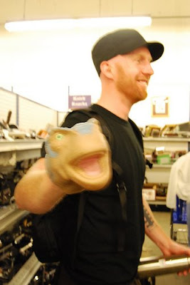 Oh and look! Here's Steve with his new Friend! Apparently he decided to replace his hand with a rubber dinosaur head instead. Oh! all the wonderful things you can find!
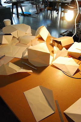 It was so inspiring to creative energy in the room and see everyone brainstorming, sketching, playing ,and exploring with materials. It was just amazing to see everyone use ordinary things and turn it into something extraordinary!!
 Hanging shade made with wire ring, staples, and letter envelopes by Mat & Dylan.
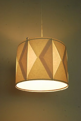 Table lamp wit braille paper and Stevie Wonder record at the base by Christine & Nick.
 Hanging chandelier made with mix match of magazine organizers by Chika & Cat.
 Come see TONS more photos here to see the entire process! The lights will also be exhibited at JOIN's Ctrl Alt Design show at Ouch My Eye, beginning June 12th, with the opening starting from 7-midnight.
Thanks to everyone who participated. It was a very fun day and great way to kick off the BRITE Collective!!
 Dylan & I are collaborating with Christa & Nin from Cafe Weekend on a new "arm" of JOIN design Seattle. It will provide a series of spontaneous and fun design events made to stimulate, inspire, and unite the Seattle design community. We're calling it Brite Collective.
Our first event, a charrette where small teams will create lamp designs from existing objects, will take place this coming Saturday at the Hiawatha Lofts in Seattle.
Here's a little preview from a trial run we did together couple Saturdays ago. The trial run was to help us go through the process in order to figure out the details when we host the actual event...it was a TRIAL....it's not us cheating! WE PROMISE YOU! The challenge:
Design a lamp shade with pre-existing object as a team. Shop at Goodwill thrift store together and spend no more than $15 total for materials. Incorporate the color yellow.
Make a lamp in 3 hours.
The process: Went to Goodwill to scavenger hunt. Got some inspiration for forms and materials. We gathered everything and had it out on a table to narrow down our choice. In the mist of all this, random people were looking over our shoulders, and some people actually picked up the things we had and was going to take it! I had to tell them to back off! See that lady on the left?...yeah..can't trust her. She was probably thinking of taking some stuff when we weren't looking! :P Beware...people at Goodwill are very aggressive...I guess its survival of the fittest..or something like that.
 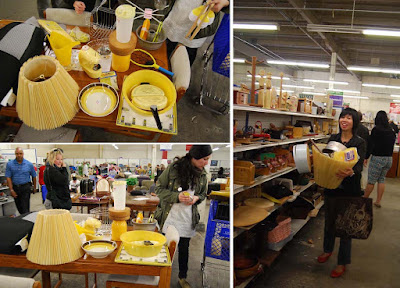 After spending 1.5 hours at the Goodwill and discussing what we liked and what we can do with each object, we ended up with these items that came to a total of $11.70. Roll of yellow stickers, 2 bags yellow basket stuffing, yellow jar beater, manila dividers, wire basket, and a tennis frame protector.
  We all liked the tennis frame since we all thought it looked like a 2D lamp shape. But somehow we convinced ourselves to make a paper mache lamp shade that would mold around the form of a light bulb...big mistake. We started doing that and by that point we were already at 3 hours! At that point, we weren't even close to being done....so we FAILED....We didn't make it in the time line we made for ourselves...
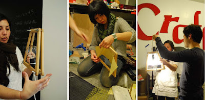 But we decided to just continue on, re-think, simplify, and finished the lamp despite our failure! We picked up the manila dividers and thought to just make that a lamp shade and clamp it in between the tennis frame. We played around folding and cutting the paper in various shapes.
 So after two more hours of iterating....Voila! We made a simple light sconce made with only the tennis frame and one sheet of manila divider.
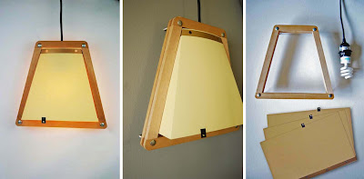 In conclusion: It was fun brainstorming and designing together, since we were able to inspire each other and explore new directions that we wouldn't do normally. And it was good that we did the trial run since when we do the REAL event, we won't want to keep everyone hostage for that long. :P
If you're interested in subjecting yourself to this kind of fun challenge email info@cafeweekend.com by Wednesday May 13th for more details on attending.
 Dylan and I went and checked out Urbancase's ICFF preview show at Cairo last Thursday. It was a great space, great crowd, and a great show overall! It was fun chatting with Darin about his experiences showing at the ICFF. Since neither of us has been to ICFF, we picked his brain apart asking him about everything involving the process and the show itself.
  It was great to see his work in person, since you can really see and appreciate the details and feel the quality of his work. I like how there's a mix of modern sleekness in his bigger pieces as well as the more humorous and playful small accessories, such as the 'Energie Lamp' that's inspired by the high voltage warning signs.
I especially love the new beeswax polaroid candles! Both Jamie & I ended up getting one for ourselves. And I happened to have the similar model camera! Now they're friends. :D
The smell of the besswax is AMAZING.......You can get one, here! On top of all the awesomeness, there were also a bunch of well decorated sugar cookies in the form of polaroid cameras and his voltage shocked guys. Super cute AND delicious!...and I ate too many of them... :P
Best of luck to Darin!

 Check out these clever juice box designs by Naoto Fukusawa. He's known for his minimal yet intuitive design approach. Ultimately he designs to avoid the need for instruction manuals or descriptions....they're pretty much idiot proof.
Even though it seems so obvious, to achieve that level of simplicity is easier said than done.
 So there's really no need to come up with juice names like "World's Best Real Fruit Juice So You GOTTA Get Some and Drink It and also Your Kids Will Love It and Get Addicted To it...Oh There's also Half Percent of Calcium and Antioxidant and NO TRANSFAT....plus FREE plastic lead toy included!!"
Not necessary.

 Just saw over at Grain Edit that House Industries came out with a WHOLE line of products with Alexander Girard's illustrations and graphics! I've been a huge huge fan of Girard's work for years now and it's great to see that his spirit still lives on. House Industries dedicated 4 years capturing the essence of Girard's work and spirit. They first started off creating some font types....then next thing they knew, they were designing toys of all sorts, plush dolls, books and more!
 See their whole collection and their great website, here.
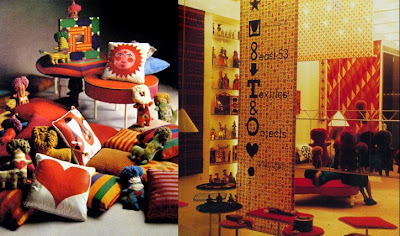
 Girard is an iconic Modern American designer who managed to integrate his expressive and vibrant colors, patterns, and graphics in everything imaginable. I couldn't help but include a ton of images of Girard's work. They're all just too good! Let's look at all his amazing accomplishments...
 he designed textiles for Herman Miller (these are re-pros of his prints on maximo) God! I want all of that!
 he designed a whole line of furniture,
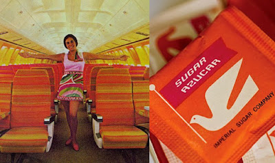
 did the branding for Braniff airline (remember those fab & glam pink and orange airplane interiors? Yup that's Girard!),
 designed the interior for La Fonda Del Sol Reasturant, even down to the smallest things like the cups, glasses, teapots, mugs, plates, placematts, utensils, napkins and everything!
Girard is just like all his other crazy Herman Miller friends from the 50's (Eames, Sarrinen, Noguchi, George Nelson, etc.) who paved the road for modern American design. I don't understand how they all managed to make everything they did so totally awesome.....I swear the crack must of been better back in the days or something...there's just no other explanation.
Here's also a little Girard 101 by Todd Oldham below:


 Ever dreamt about what your perfect cafe would feel and look like? I saw this on awhile back on Twig&Thistle, (Kathleen finds the best packaging inspirations!) and all this makes me totally jealous of the Scandinavians and how they're always one step ahead with their coolness. I love everything about this adorable place, SIS. Deli+Cafe in Finland. Not only do they have a well designed cafe that specializes in ecological and organic products, but their branding and packaging is totally perfect. I've always wanted to visit Finland and the surrounding Scandinavian countries. They seem to have such a great sense of warmth and thoughtfulness with their flawless integration of design in their everyday lives.
Just look at it....so simple, so fresh, so clean, so cute and handsome all at the same time!! I just love the use of black & white checkered pattern through out.
 In the words of Liz Lemon: "I want to go to there"....and steal their coffee cups, bags, cookies, and even their menu. I bet even their napkins are cool....I'll take a whole pile of them. Okay, fine... I suppose I can pay 1 Euro for a heart-shaped cookie.
 So as you know, last Dec, Dylan and I were part of JOIN: Design Seattle show. It was at this show that the first Ladies & Gentlemen Studio pieces was born...our Alpha Brass lamps and Mega Doily rug.
  We're proud and honored to part of this new up & coming design collective along with other awesome Seattle designers like:
 Iacoli&Mcallister and
  Gray pants. We are combining all of our forces to build a stronger design community in Seattle showcasing North American Designs through JOIN:Design Seattle. We are excited to present our next event, and our first juried show:
 JOIN and Ouch My Eye are seeking submissions for Ctrl+Alt+Design slated for June 12th, 2009. The juried show will primarily focus on showcasing work by emerging American designers working in the areas of furniture, lighting, soft goods and home accessories. You can get more details about the show and apply, here. This is a good excuse to turn that napkin sketch into a real thing. It's free, so you just gotta make it happen!
We're looking forward to see all the submissions! Remember the Deadline is MAY, 8, 2009. So feel free to apply and spread the word to any desingers out there, too!
Check out JOIN Flickr site to see photos of our past shows.
Please contact Jamie Iacoli with any questions at:
press [at] joinDesignSeattle [dot] com.
Ok, maybe the title is a little dramatic, but I can't help but feel giddy after resounding success of JOIN: Design Seattle's second opening at the Vermillion Gallery last Thursday! Everything came together to be an inspiring display of refined, unique, varied, viable products. Amazing job everyone involved! Special props to Jamie and Brian from Iacoli & McAllister for putting the show together. Also thanks to the Vermillion for hosting us. If you're in Seattle, definitely check out the show and the space (which has an adjunct bar/eatery in the back). The show runs through Jan 4th.
We want all of these in our living room!: Urbancase credenza + Submaterial felt wall hanging + Ladies and Gentlemen's Mega-Doily area rug
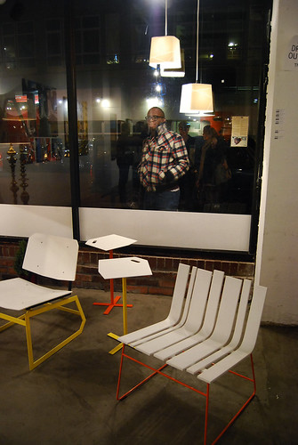
Iacoli & McAllister's Corian and steel furniture and lights
Close up of Submaterial's felt wall hanging...all 900+ cut and assembled by hand!
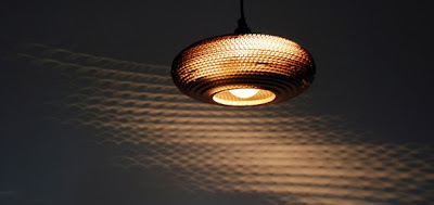
Gray Pant's genius cardboard lighting. Photography can't describe how awesome the light travels through the cardboard layers in person!
Meet Me Here's bags: Jean just had to buy one!
Ladies and Gentlemen first studio project: AlphaBrass! Stay posted for more info on our projects.
There will be an one-day only sale at the opening with some great smaller affordable items such as holiday ornaments, jewelery, bags and more!! Can't miss it!!
We just got back from setup where we witnessed first hand how sweet the show is going to be. Everyone's stuff looks great in the space and we're so psyched to be able to participate.
See you there!
 On top of all other mayhem this holiday season, we're super excited to be participating in a design show that is showcasing NW design. It's called JOIN: Design Seattle and will be taking place beginning at the opening on Dec 11th at the Vermillion Gallery in Seattle.
What does L&G have up their sleeves you ask?? Here's a sneak peak with some process shots:
We're presenting two separate but related projects that look at ways to re-represent classic forms of vintage objects in ways that showcase their inherent qualities. Just like the goods in the L&G store, our goal is to help facilitate an appreciation of existing objects.
"AlphaBrass" is a series that re-formats ornate brass lamps in ways that enhances the varieties of classical forms they are available in. These lamps are modular, so the potential to mix and match is limited only on the supply available from local thrift stores. Adjusting scale, paring down details and reiterpreting function will hopefully promise to add value and appreciation for these typically stuffy living room fixtures.
For "Mega-doily" (the second project), Jean has taken her new found appreciation for crocheting doilies and channeled it into a grand interpretation of the common table top item. The result is an area rug with a satisfying knobby texture and bold graphical presence.
There will be more posts on both of these featured as we wrap up the final details and get these to the Vermillion just in the nick of time. If you're in the Seattle area, please please come visit us and come see it in person plus 6 other designer's work!
 A dear friend of Chikabird Inc. (my other business with another partner, Chika) recently had a studio opening. We're lucky to tell you that this dear of ours friend is Herman Yu of beautifully designed paper goods. With Herman's uncanny sense of style, she had created a delightful studio space, which was indeed an inspiration to see. Oh, the warm sunlight filled room, the open airiness of the space, and all her nature inspired designs....I can see myself hanging out there all day....if only Herman would let me. :)
Read more about Herman's opening via Birdhouse Blog by Chika!
Hi everyone, this is Dylan, Jean's bf. Jean and I really dig abandoned, dilapidated, and generally run-down buildings. Whenever we travel, we make it a point to try to find the areas of our location that may have abandoned sites that nobody really cares about. There's something about being there documenting a forgotten place that fascinates us. I'm going to blog about them from time to time.
Anyways, here are some photos of one of the most interesting locations we've been to. We visited these two sites when we were in Taiwan fall of last year. They're these very crazy pod-tastic vacation homes built as beach getaways for Taipei's middle-class in the 1960s. They're located at two points along the northern coast. The first in the set is set of individual modular dwellings arranged right on the Northeast coast. The second set is located on the Northwest side of the island in the San Chih area. Each are said to have been abandoned not long after they were built because several mishaps during construction and typhons led inhabitants and locals to deem the sites cursed. It is also rumored that no one can build over or on these sites because spirits lie in limbo there. Building on such a location would be a big no-no for the Taiwanese. That's fine by us because these sites are wearing away beautifully and we got to see them in all their decaying grandeur. It's great because so many things in Taiwan have become tourist attractions, but these are amazingly untouched. We hope they stay that way. Click here for more...-Dylan