Viewing entries in
Design Related

Comment

The Cedars

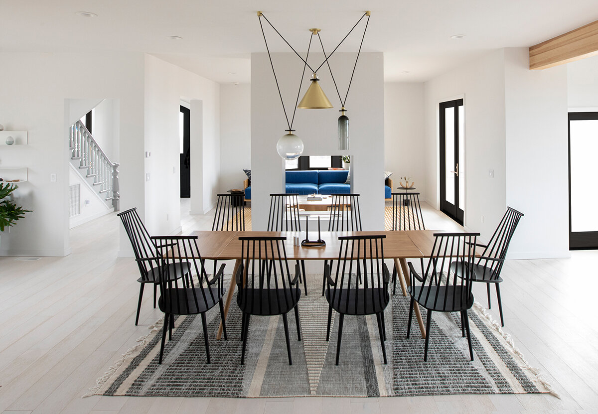
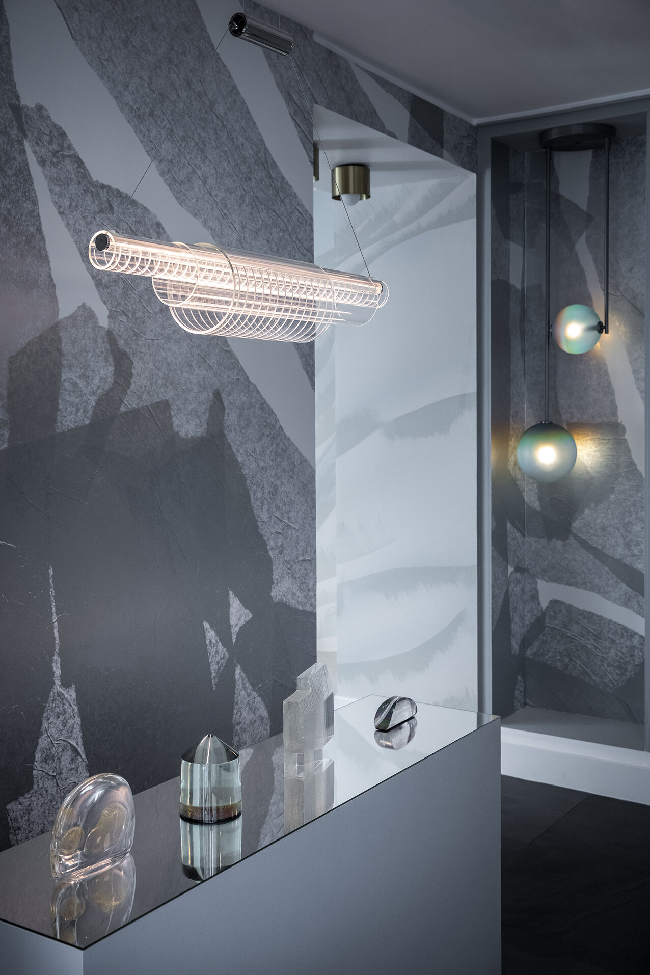
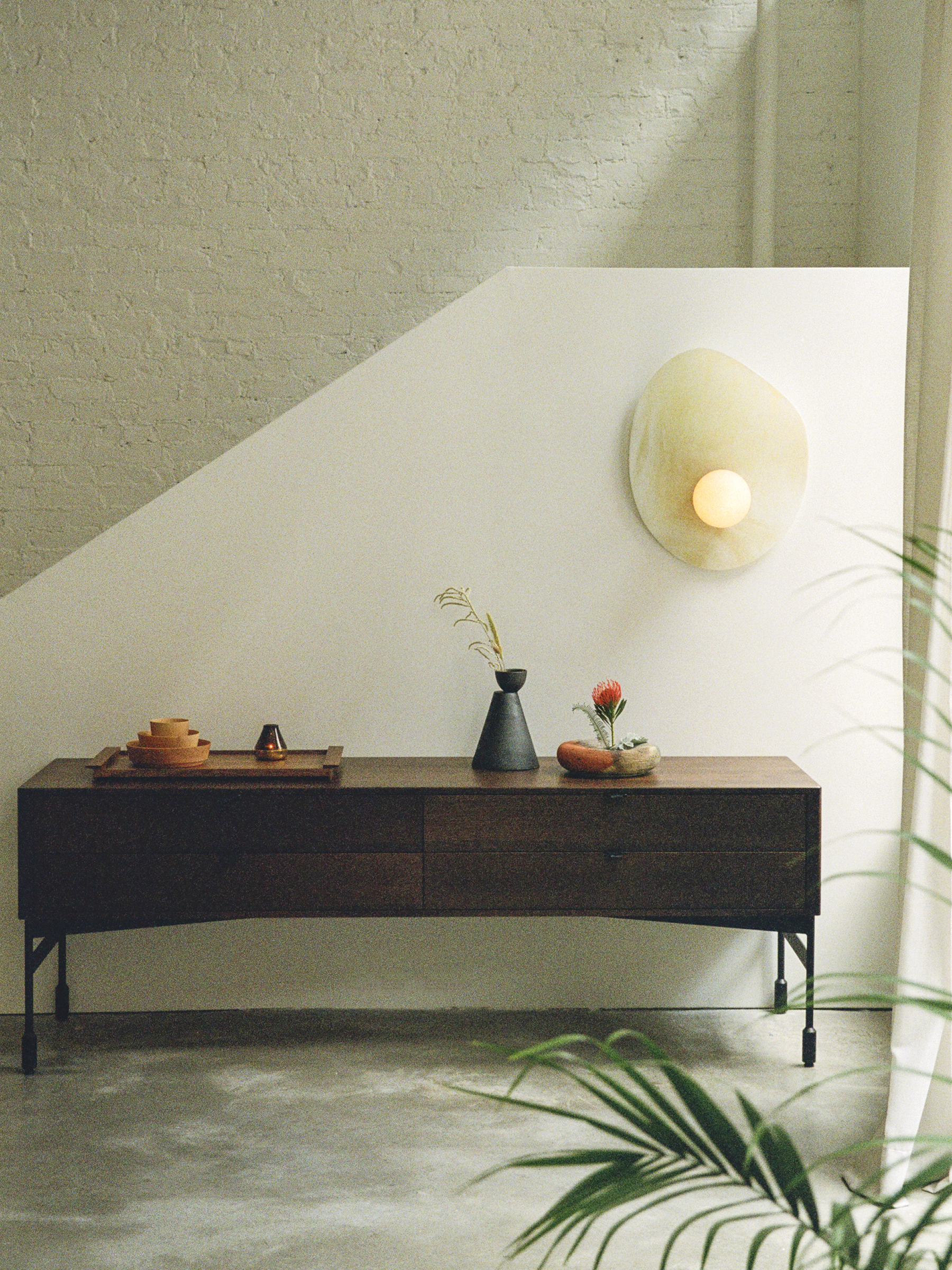
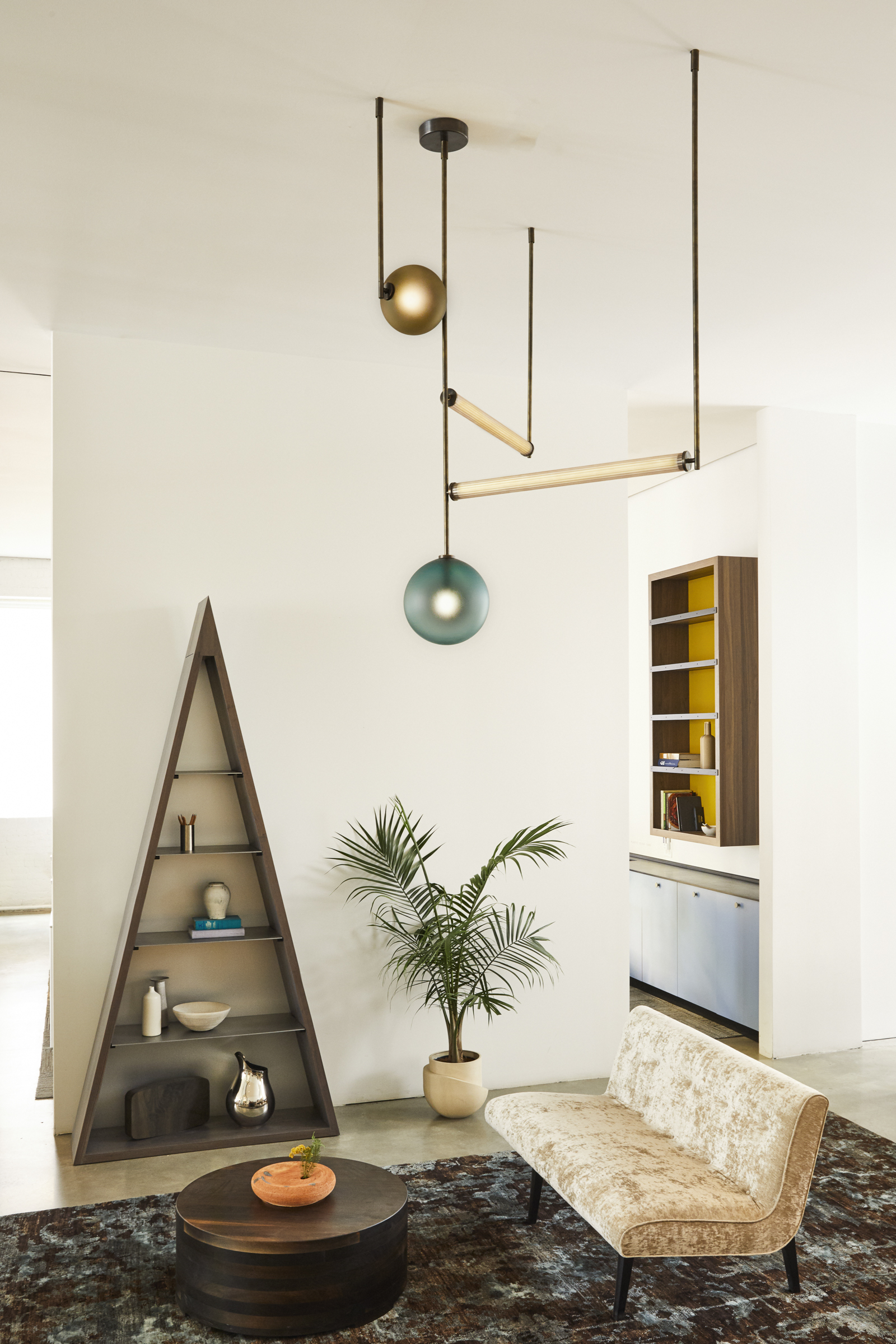
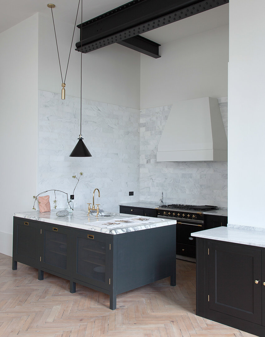
Photography: Charlie Schuck Lighting: Shape-Up by L&G Studio 

Photography: Charlie Schuck Lighting: Shape-Up by L&G Studio

At this time of uncertainty and anxiety, we've all had to look inward at ourselves and our surroundings to create new forms of balance and harmony in a chaotic world.  This symbiosis of people and space has always been a core value for us.  In this spirit, we'd like to share some of our favorite projects in which we've contributed to creating a powerful sense of place.


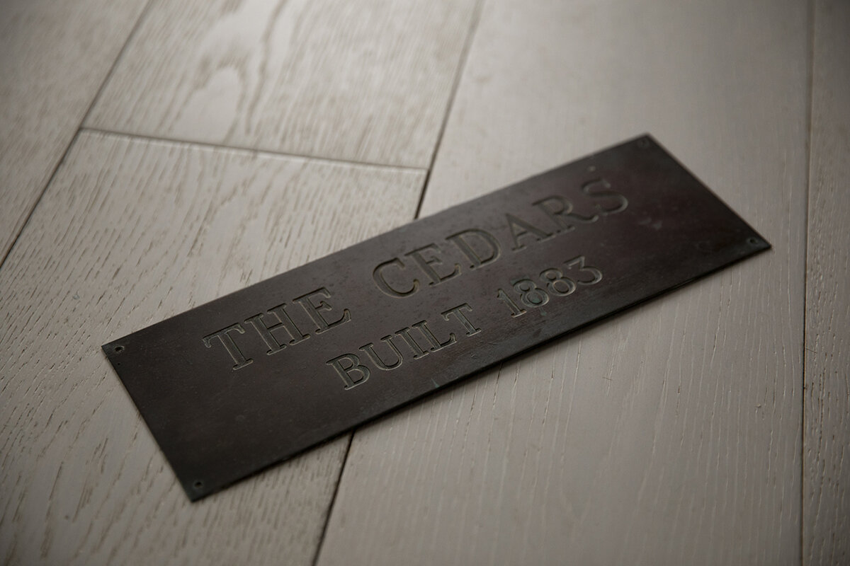
Originally built in 1883, The Cedars sits between the bay and the sound, at the entrance to the quiet town of Orient, New York. A few years ago a young couple began to envision the house as a place that would not only pay homage to the history of the place, but also fit their personalities. They wanted something design-forward, light, bright, and full of art and design. They then teamed up with Michael Yarinsky Studio to breathe life into their vision for the interiors and detailing.

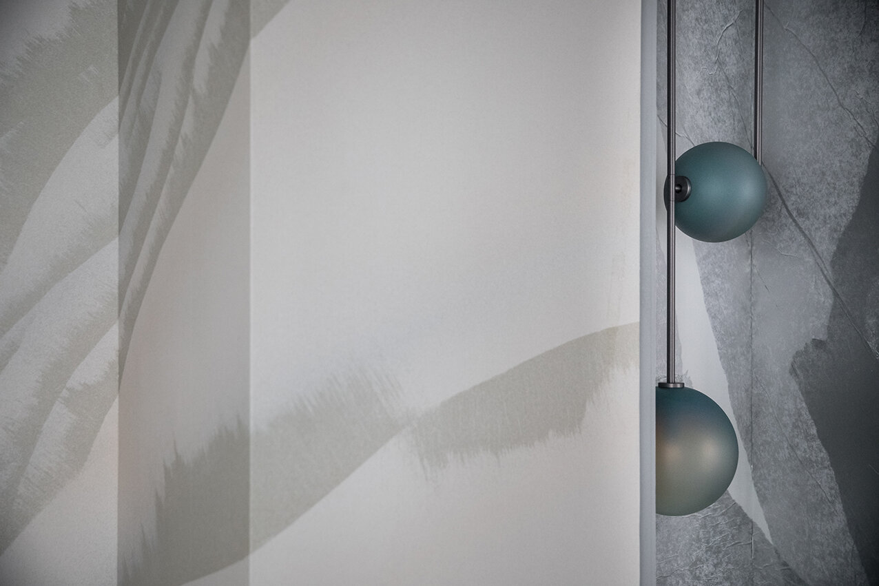
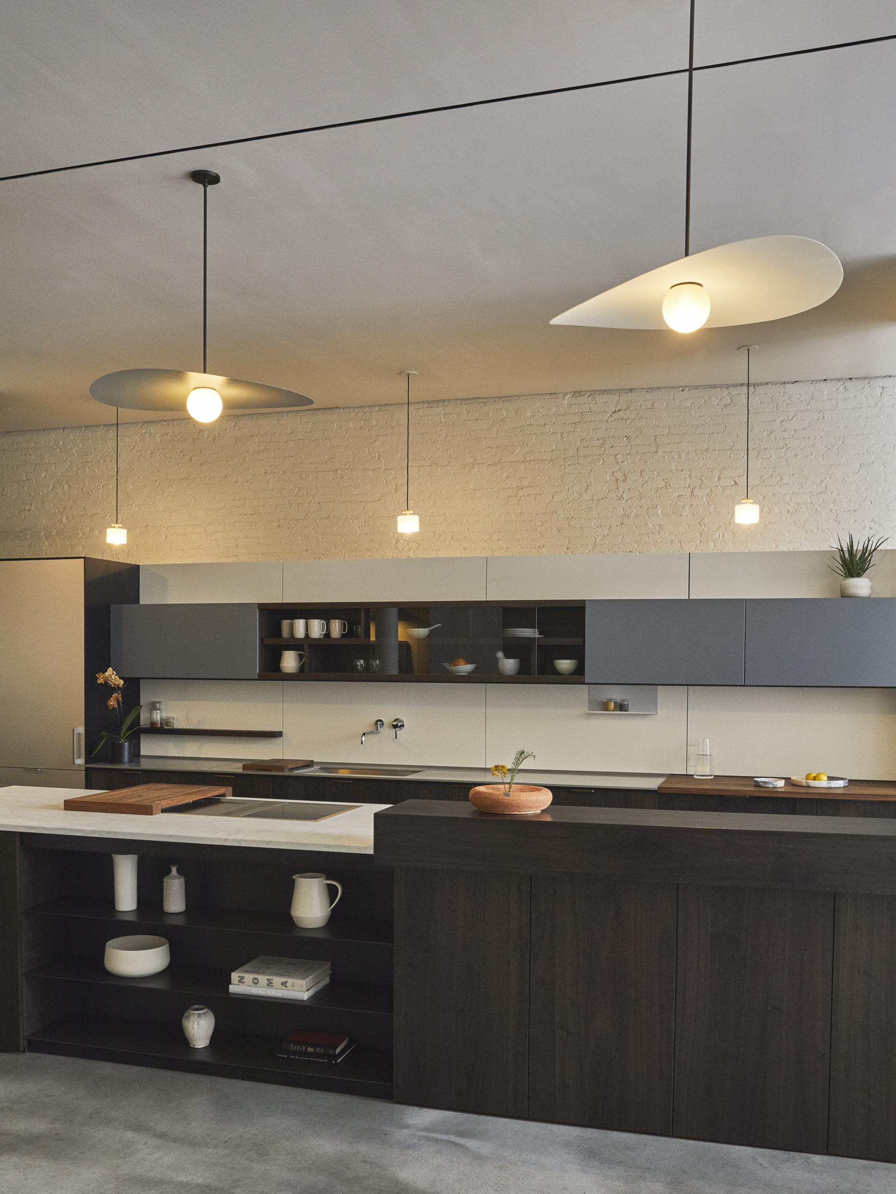
Photography: Charlie Schuck Lighting: Myrna by L&G Studio 

Photography: Charlie Schuck Lighting: Myrna by L&G Studio

As the house overlooks the Long Island sound, the scenery is ever-changing - with each unique sunset bathing the home in color. The interior references the moment when the ocean meets the sky. The color selection consists of muted blues and greens, contrasting with white-washed floors. The wallpaper captures ethereal mood and movements of the water. The lighting is playful and simultaneously brings together and elevates the use of organic materials in the home. The space is kept open with many moments of congregation with the intention of welcoming family and friends, over communal meals, shared stories, and intimate conversations.  This communal spirit in mind, it was important to Office of Tangible Space and the clients to work with emerging designers as well as locals from the North Fork community. 

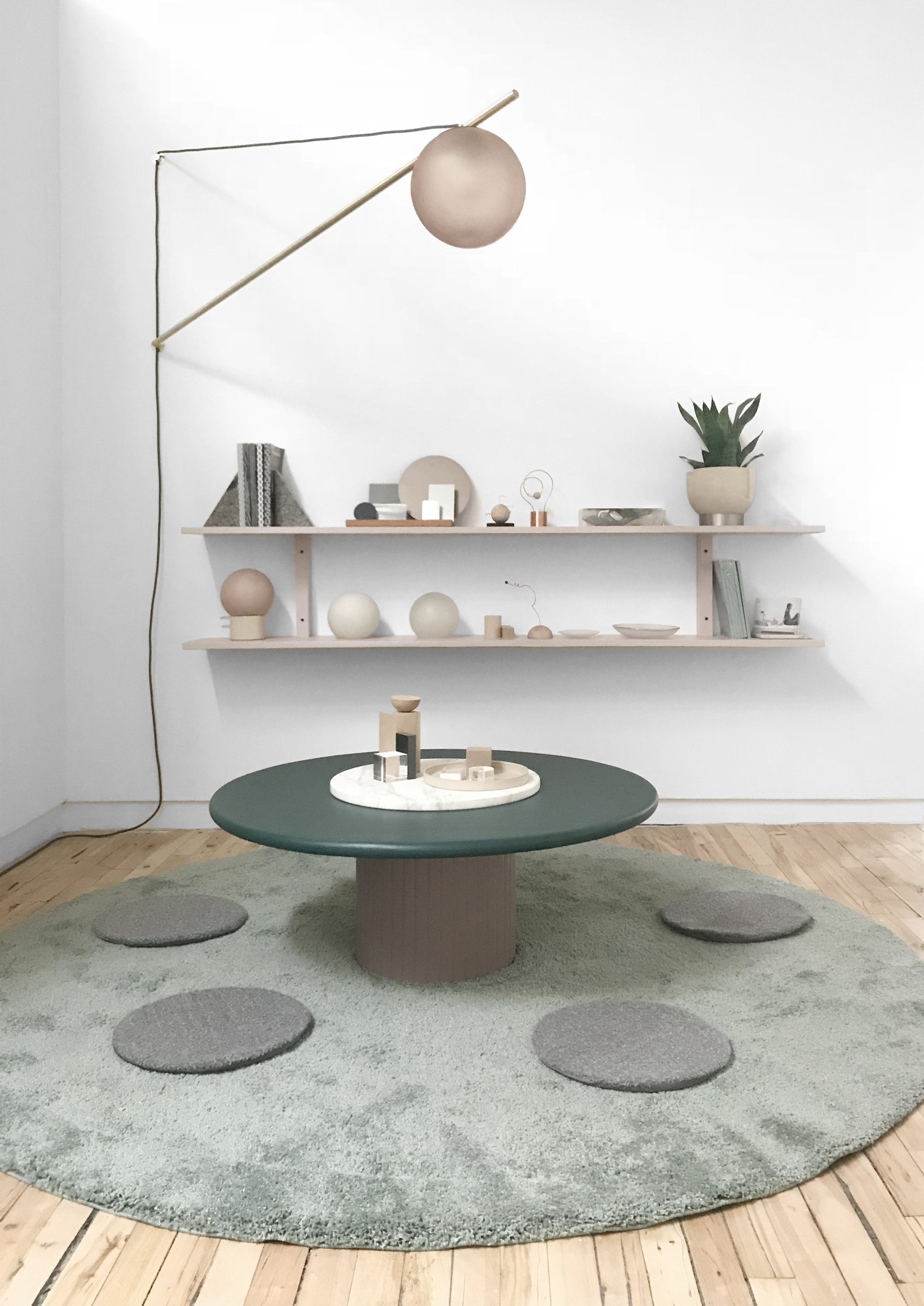
Photography: Charlie Schuck Lighting: Maru by L&G Studio

Photography: Charlie Schuck Lighting: Maru by L&G Studio

"We love working with Ladies & Gentlemen Studio for so many reasons. Their practice is rooted in craft, community, and process in a way that few studios these days actually are - and it is so needed.

The empathic approach L&G takes to a rigorous traditional design process yields incredible humanistic design. Their studio also has a focus on community building and digging into design history which are parts of the design world often overlooked."


-Michael Yarinsky, Principal
Office of Tangible Space

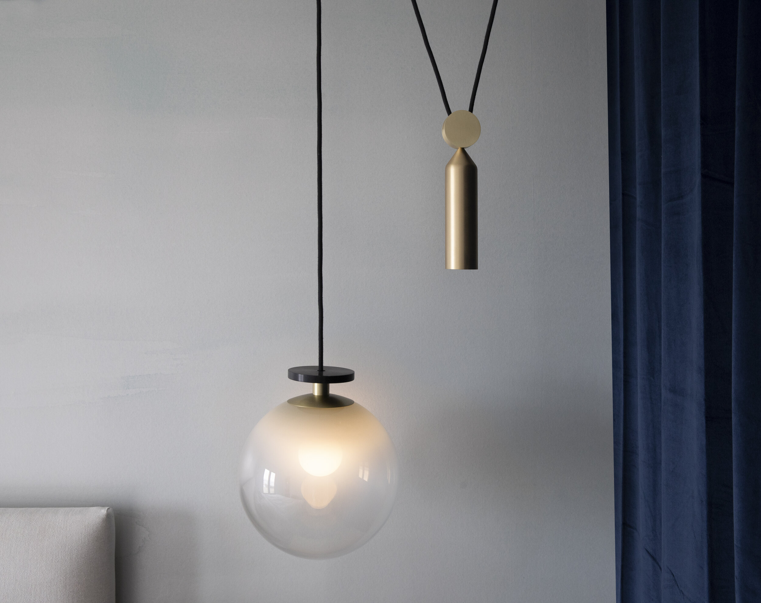
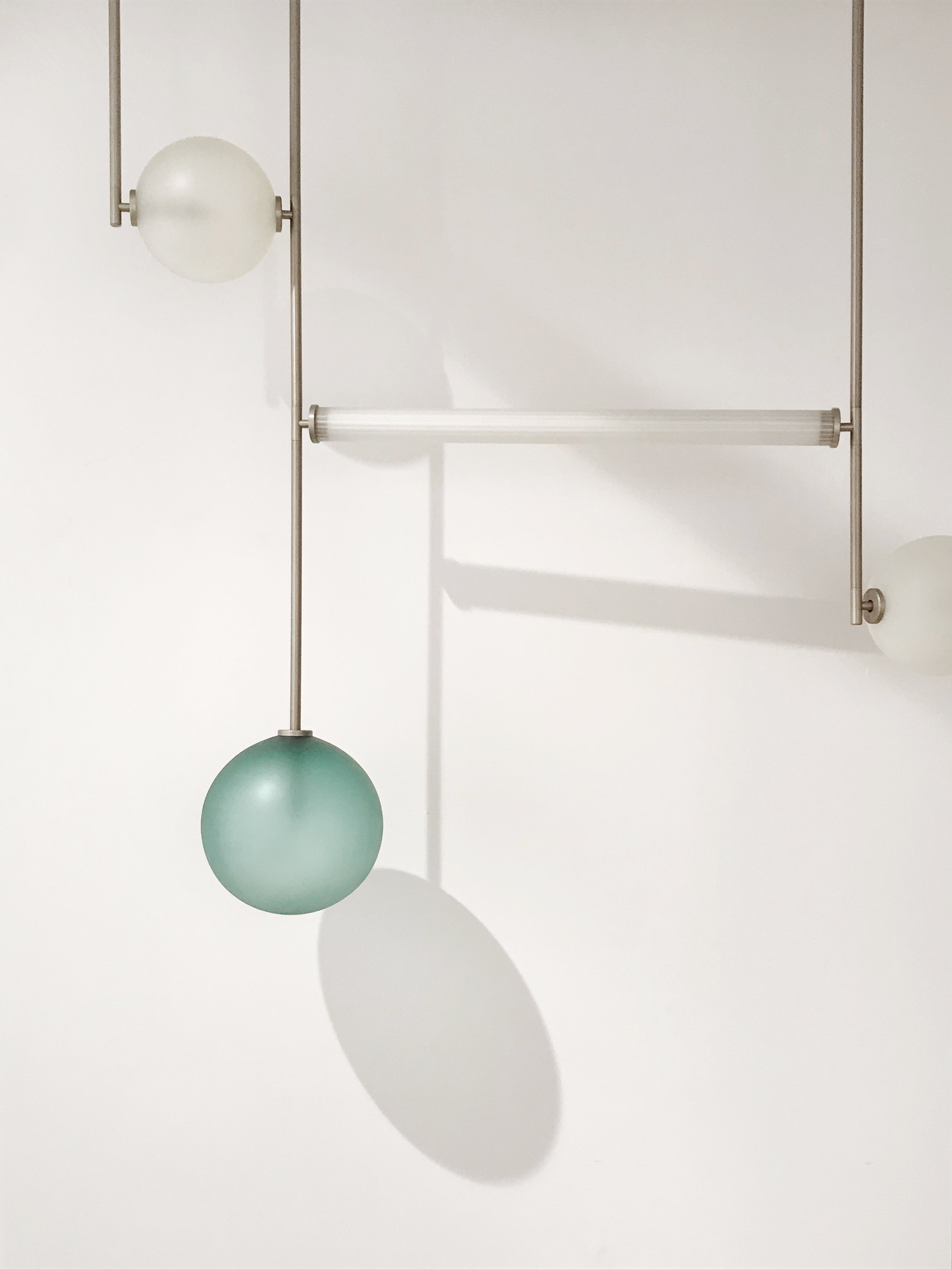
Photography: Charlie Schuck Lighting Clockwise: Shape-Up Pendant & Spun Pendant by L&G Studio

Photography: Charlie Schuck Lighting Clockwise: Shape-Up Pendant & Spun Pendant by L&G Studio

Maru by L&G StudioHere at L&G, nothing makes us feel more fulfilled than seeing our products so thoughtfully integrated into their surrounds.  When carefully considered in conjunction with space, we believe objects have the power to bring functional and emotive cohesion to everyday life.  The Cedars is such a prime example of this potential.  

Office of Tangible Space has been a valued collaborator of ours for many years, over which we've built a relationship of mutual admiration and creative synergy that yields better and better results over time.  This is the type of alignment we aspire to in all of our relationships.  

In this spirit, our studio remains open (remotely), ready to discuss ways to make your spaces harmonious and meaningful.

Comment

3 Comments

Thoughts on New Materialism

On May 14th, we were invited to be part of a new design lecture series called People In Places to speak and write about our design approach in response to the concept of intimacy. As design explorers, we hold a core belief that objects are key to creating harmony between people, rituals, and space. Here, we’d like to share an in-depth essay expressing our contemplative process for and evolving process for discovering an object or material’s physical and implied meaning as a way to create deep meaningful relationships with the things we live with and make.

IMG_3391+2.jpg

To the sand at Beach 92nd St, Rockaway Beach

As I sit with you, around you, and on you, I feel immersed and I begin to discover your complexities.  You hug my feet, you sit on my lap clinging to me.  You also run away, chased by the wind.  You are indeed a collective in a phenomenon, but on close observation, each grain of you is incredibly unique - each with your own color, shape, size, and, I presume, origin story.  But as a whole, you’re giant - quiet and tolerant, yet abrasive, persistent, and adaptive.  You seem to be a constant but you vary greatly over time, the extent to which I really have no notion of beyond the last 30 days I’ve spent observing you as a newcomer to this beach.  In that time, however, your character seems to shift greatly from day to day and I think that’s why I find you to be intriguing in a “more than meets the eye” kind of way.  Perhaps you can tell me how far you’ve traveled and from how many places your tiny grains are from?  Are there stories of the great boulders you used to be part of?  And really, how many years ago was that?  How did you get here? By way of some epic storm, a long arduous odyssey, or more mundane means?  

It’s my presumption that your path from a grand boulder to a million granules leads to some conflicts from a self-identity standpoint that you have had to come to terms with.  Just because you’ve broken into pieces doesn’t necessarily mean you’re any less of a thing -  you’ve simply divided in a way that feels more like an expansive multiplication.  As you’ve grown smaller, lighter, more nimble, and ephemeral, you’ve become sand.  At some point in your adolescence, you could probably be defined as just a singular rock, but by and by you graduated to gravel, and then to the fine granules you are now - Sand!  You’re no longer singular, but collectively an expansive ubiquitous noun and quite literally, by extension, the earth itself.  Have you entertained the possibility that you and the grain next to you were once the same rock?  Could it, therefore, stand to reason that you and I can somehow trace our roots back to some distant form of existence as simple matter?  If so, it’s great to connect again after all of these years!     

sand mix.jpg

Did you know that some of you were once put in plastic bags and shipped to me in Paris where you temporarily led a completely different existence as an “immersive interior installation”?  I pretended I knew you there, guessing what you wanted to do, could do, should do, and what you mean.  My friends and I made up a narrative about your beauty, mystery, and lore.  It was a naive, but referential moment musing of mirages we hadn’t seen and attempting to recreate them in a place where you normally wouldn’t belong.  

At this moment here at the beach, I feel I am understanding you and appreciating you much more than before.  Here and now I feel embedded in your natural habitat although I can’t be 100% sure if this is the case.  What actually did plant you here to Rockaway Beach?  Was it random acts of nature or a result of some planned human intention.  Regardless you seem free to be yourself here and I admire that.  You also seem appreciated by humans to some degree here - a rarity for us when it comes to natural resources.  

IMG_3002.JPG

I’m not sure you realize this, but you’re delivering memories to us by sensations we don’t normally feel.   When it’s sunny and hot, we come to visit you and you get in our food and eyes and ears causing all sorts of mild discomfort yet your presence represents a freeness that exists only on the shore and further romanticized in our memories.  In this way, you offer a special value proposition.  We at once take you for granted and deeply appreciate you for being you.  

IMG_4396.JPG

I also wonder about your future.  Are you destined to be dust?  Or concrete?  Or glass?  Or a beach for eternity?  Not many of us on the beach here think of you being the workhorse you are.  Without you, where would we be sans concrete, glass providing structure, protection, and light?  With humanity’s forceful hand, your millennia of transformation from boulder to grain is trivialized by heat and chemistry.  Pulverized and molten, you take the forms we dictate.  You’re an abiding servant - modern man’s best friend.  What’s your feeling on this?  You seem so easygoing, but how would you embrace becoming “useful” in human terms?  I can only hope as I get to know you that we grow to appreciate you for who you are - in the many forms that you come.

Sincerely,  Your secret admirer


New Materialism

At their basic level, the objects in our lives serve as mediators between thought and behavior in space and time.  We believe that objects have the power to affect this behavior and this is why we feel the topic of human-object harmony is of critical concern in an effort to shape a better future.

Our relationship to objects is a lot like our relationship with each other.  One cannot argue with the notion that surrounding yourself with positive, productive, inspiring, helpful, charismatic people will make you happier and more fulfilled.  Because objects are an intermediary between these relationships, we believe we should look for much the same in a chair as we do in a friend.

As a foundation, a useful object inspires a strong relationship.  Like a helpful friend with a pickup truck on moving day, a useful object will elicit appreciation, encourage productivity, and continuous use if it’s well-fitting of its function.  It’s a very baseline thing, yet most people can attest to the fact that few daily objects actually do this.  We’re in fact surrounded by many more “bad friend” objects than good ones.  It’s important to ask ourselves why this is and how long we can continue unhappily in such toxic relationships.  

Alongside utility sits the more complicated emotive side to an object place in the world.  With this comes the potential of an object that taps into one’s psyche in a way that creates an emotional bond between people, the ritual, and the object.  This puts an even greater responsibility and opportunity on the designer’s doorstep because anything and everything can provoke an emotional response.  It just becomes a question of what type of emotion.  The industry knows this and subverts it with consumption-driven objects sold on emotion rather than functionality.  However, just because this is the case doesn’t mean there aren’t other models design can follow.  We believe emotion and utility can align to inspire more enlightened relationships between thoughts and their behaviors - this is where a new type of materialism can emerge.

_19A7056.jpg

Projecting truth 

Honest intentions and thoughtfulness from the creator is something that is irrevocably embedded in the character of an object.  We believe that this is the calling of the designer to imbue an object with a positive thoughtful spirit that they would want more of in the world.  From there, in small ways, that intention inspires similar feelings in others - slowly and surely we can take greater control over what we use and why.

Observation is an honest designer’s best tool.  Before jumping to a solution, it’s imperative that we first cast aside our intentions to strip away preconceived perceptions and open ourselves to the realm of possibility.  This not only means listening to what people have bought, say they want, or are willing to buy, it means absorbing your surroundings from a point of curiosity and wonderment.  It means engaging all your senses.  It means being patient, open, flexible.  It means looking between gaps to a negative space between thinking and actions.  In that space, there are often “solutions” or clues waiting to be revealed. 

From there, it’s connecting dots.  It’s a process of framing the truth that’s been felt through metaphor, allegory, and relationships to establish meaning.  While this is the designer’s viewpoint and expression, because it comes from a place of honest observation outside of themselves, the work is a by-product of curiosity and empathy.  It’s from this point that we believe a higher level of harmony can come into being.  It’s a point at which the questions of how an object is made, what it's made out of, what it’s for, and why it’s great all have transparent answers.  While the resolution is subjective, the statement is backed not by ego, but by a desire to share in a collective experience of ritual and balance.  

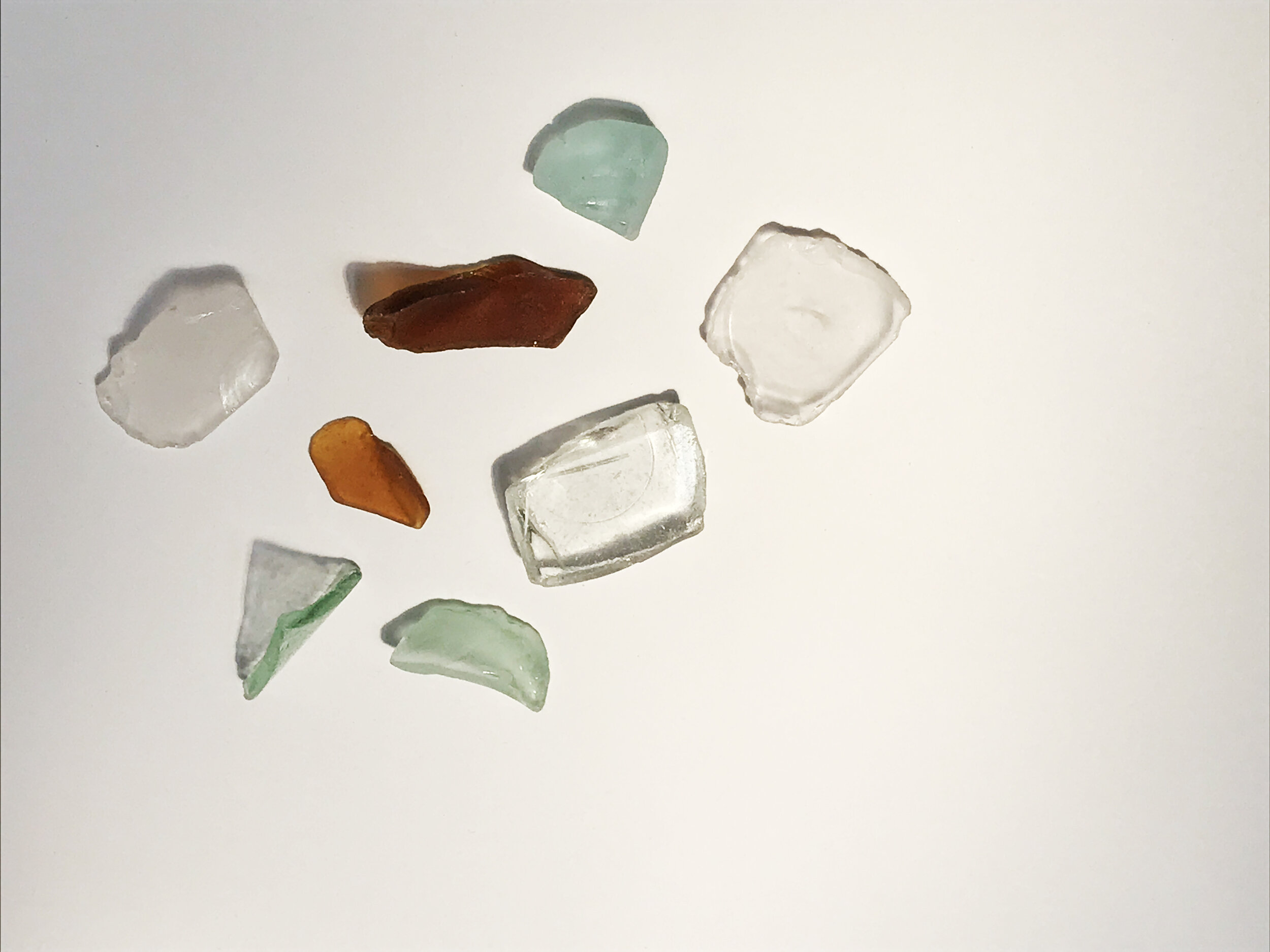
clear glass mix.jpg

Upon Observation

An object has two facets:  

  1. It’s physicality - The attributes about the object that gives it material presence.  This materiality already has embedded truths about how it was made, what it used to be, and what it will become.  

  2. It’s implied meaning - this is everything we ascribe to the object’s function and value.  Everything about meaning is implied by human perception - including the physical form it has been given by its builder.  

We believe that in order for there to be honesty in an object, it’s physicality must be in harmony with it’s implied meaning.  To facilitate this, a designer should seek to fully comprehend the material’s truth before ascribing its meaning.  This requires a curious investigation.  

glass light mix.jpg

Planes of potential

Any horizontal surface - the ground, a floor, a table, an empty shelf represents a state of silence or emptiness and horizontal plane upon which anything can be placed and any activity can play out.  

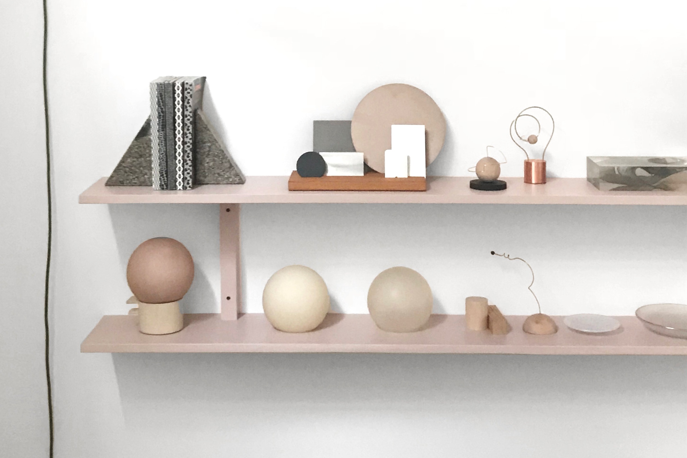
Our studio’s focus is on the furniture scale.  At this level, a horizontal surface represents a place to rest, work, socialize, observe.  While the table and chair are objects of glory, they represent a relatively finite set of possible actions:  A chair is to rest our bodies and a table is a host to our actions.  Shelving, on the other hand, has a more amorphous meaning.  On the surface, a shelf is a storage on which we archive things we aren’t presently using.  In contrast to a closet or cabinet however, the role of open shelving is invariably emotive.  An open shelf is a curio of objects that have enough value to display regardless of utility - this fact reveals a huge emotive facet to shelving’s identity in a domestic landscape.   

_19A6956.jpg

An object on a shelf is a performer on a stage.  When placed alone, it gives a monologue.  On a shelf, we can interview it.  There’s a reason something is put on a shelf for the first time that may be mundane, but in many cases, it’s not.  There’s some connection to that object that warrants keeping it out in view on display.  As designers we want to know why we feel compelled to archive the objects we do - so we listen to them when they’re on stage.  As we become acquainted with each other, we realize we have common interests and values and we notice things that were previously perhaps subconscious:  how an object’s smooth edges invite a touch, how sharp edges catch the light, and how a scratch or dent can be an endearing mark of character.

With several objects on a shelf, we become composers and matchmakers.  Using what we’ve learned about the objects, we create stage sets, construct characters, plots - combinations of materials and forms in search of a meaningful storyline.  We create these based on curiosity, imagination, and hypotheses alike.  There is a directness and an informality to creating on a shelf.  The shelf is a neutral ground not just formed by a horizontal plane, but a vertical backdrop that frames the objects in space and minds isolated from location, context, and function.  On a shelf, a material is allowed to have its own signature voice and we are there to receive it.  We listen, we feel, we mix, we turn, we modify, we have a dialog. 

This dialog gives way to become new things by and by.  The material combinations in the chorus eventually hit moments of harmony and resonance with us.  At this moment, our voices sync and the material is ready to become a designed object.  In the adoption of it, we volunteer to share its voice in a new light and new truth in hopes that others will hear it.  

Our goal is that our creations can become part of new human-object harmonies that give these materials an elevated place, purpose, and meaning bolstered by function and thoughtfulness.   We strive not to stifle the voice that originally spoke to us but to broadcast it over new stages - to inspire a chain of wonderment and connection.  Ears, eyes, and hands who will hopefully grow to reconsider how their thoughts and actions relate to their environment at large.

_Q2C9691.jpg

Watch the recorded lecture of People in Places 003: On Intimacy

with Chiaozza and Ladies & Gentlemen Studio


INSPIRATIONAL REFERENCES


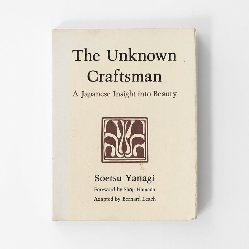
unknown%2Bcraftsman%2Bcover.jpg

THE UNKNOWN CRAFTSMAN: A Japanese Insight into Beauty

by Soetsu Yanagi, 1972

Soetsu Yanagi 1889–1961: was a philosopher, art historian, aesthete and poet (also father of Sori Yanagi). Yanagi took noticed of the beauty in works of unknown craftsmen and became the founding father of the Japanese and Korean folk crafts movement called the Minge (民芸)Movement to protect the art from from disappearing during the Modern Industrialization era.

READ CHAPTER: Towards a Standard of Beauty

“I would like to believe that beauty is of deep importance to our modern age. Without Question, the intention of morality, philosophy, and religious belief is to bring hope, joy, peace, and freedom to mankind. But in our time religion has lost its grip. Intellectualism has undermined spiritual aspiration in most people. At this juncture, I would put the question, might not beauty, and the love of the beautiful perhaps bring peace and harmony? Could it not carry us forward to new concepts of life’s meaning? Would it not establish a fresh concept of culture? Would it not be a dove of peace between the various cultures of mankind?”

-Soetsu Yanagi


listening to stone_isamu noguchi.jpg

LISTENING TO STONE: THE ART AND LIFE OF ISAMU NOGUCHI

By Hayden Herrera, 2015

This biography of Isamu Noguchi, who is known as the 'sculpturing of space’ sheds an introspective perspective of his life and his philosophy in his work and view of the world as he searches his own 'essence of sculpture'

PREVIEW BOOK HERE

“If sculpture is the rock, it is also the space between rocks and between the rock and a man, and the communication and contemplation between.”

-Isamu Noguchi


stuff matters_cover.jpg

STUFF MATTERS: Exploring the Marvelous Materials that Shapes Our Man-Made World

By Mark Miodownik, 2014

This book dives deep into looking into 10 different types of ubiquitous materials commonly found in everyday objects we all use. Miodownik dissects each material by looking at their chemical properties, historical origin and context and how each material become what we see and use today.

READ CHAPTER: INVISIBLE (Glass)


the missing piece meets the big O.jpg

THE MISSING PIECE MEETS THE BIG O

by Shel Silverstein 1981

This is a classic children’s book and the sequel to the first book “The Missing Piece” where the missing piece embarks on a transformative journey discovering the world and itself.
READ FULL PDF VERSION


emergence_Book-Combo-001.jpg

EMERGENCE MAGAZINE

A quarterly magazine and podcast that focuses on ecology, culture, and spirituality and shares a mix of introspective essays, stories, poems and practices relating to those topics.

READ PRACTICE BOOKLET Vol. 01


6_everything-is-alive-podcasts%2B.jpg

EVERYTHING IS ALIVE PODCAST

by Ian Chillag for Radiotopia

This is a delightfully humorous yet poetic podcast where the host, Ian Chillag interviews supposed “inanimate” objects of all sorts asking them intimate questions in regards to their existence and purpose.

Episode 7: Grain of Sand (LISTEN)

Episode 17: Plane of Glass (LISTEN)


3 Comments

Comment

Hands to Work

Photography: Charlie Schuck Lighting: Shape-Up by L&G Studio

Photography: Charlie Schuck Lighting: Shape-Up by L&G Studio

'Hands To Work, Hearts to God', was a key tenet of the American Shakers:  a mantra centered on the idea that something as simple as putting your hands to good use - be it cleaning, cooking, or making beautiful objects and tools - can lead to a higher spiritual state of mind.  

Now, during this time of distress, we've found the Shaker ideals resonating with us even more especially at a time when there’s so much to ponder as the world reconsiders everything from social and economic order to the small simple everyday things and to rethinking our personal and collective values.

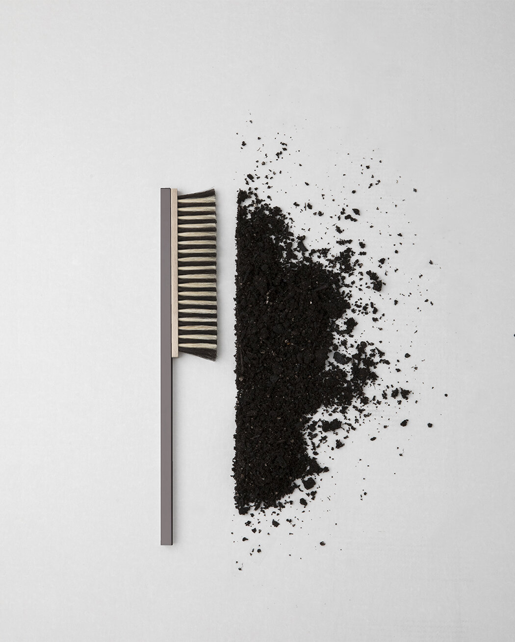
Product: Sound Brush / Photography: Charlie Schuck

Product: Sound Brush / Photography: Charlie Schuck

What used to seem unimportant, trivial, mundane or even optional is now a necessity and disposable objects that weren't given a second thought to a month ago are now precious rare commodities. In a matter of weeks the whole world seems to have shifted into a new frame of time, new mindset, new rituals, and new values.

The pace of the pandemic is unprecedented, however, things like cleanliness, caring for others, persistence, and resiliency have always been important virtues for society.  As designers, objects, rituals, and meanings are something we think about often - perhaps just under different lenses in better times.  With all the changes in the world, we’re reminded that the mundane isn’t something to overlook - which is why we want to take this moment to look back and share one of our favorite Furnishing Utopia exhibitions Hands To Work back in 2018.

Collection from Furnishing Utopia / Photography: Charlie Schuck

Collection from Furnishing Utopia / Photography: Charlie Schuck

'Hands to Work' is the third in a series of group shows responding to the study of the American Shakers.  Organized by Furnishing Utopia, and sponsored by Design Within Reach, this show prompted 25+ international designers to reconsider the rituals behind simple everyday chores from cleaning to organizational work.  The Shakers were the starting point as they believed that a day’s work on earth put one closer to heaven.  Designers were asked to consider this while creating objects that speak to a modern chore and the ritual behind it.  The resulting exhibition, curated and creative directed by L&G, debuted in May 2018's NYCxDesign to a delightfully receptive public.

In celebrating the simple act of doing chores, L&G created a series of brushes titled, 'Sound Brushes' with the help of a Swedish brush-making brand, Iris Hantverk.   The simple cleaning brushes embellish the rhythmic action of brushing - giving haptic feedback to the motion through internal beads that act like sound instruments - bringing more sensory awareness to the act of cleaning.  

We also created a series of small objects around the idea of frugality and not taking resources for granted.  The 'Waste-Not' soap encourages people to take the last little bit of the previous bar of soap and join it to the new soap bar.  The 'Waste-Not' bottle holder is a sculptural base to hold shampoo and or self-care products in bottles upside to get out every last drop.  While these practices seem trivial - the habit of not wasting things can easily translate to many parts of our lives.  We embrace the idea that small things can add up to mind shifts that create big change collectively.

Creative Direction: L&G Studio /  Videography: Charlie Schuck 

For the exhibit, we created a short video embracing the pleasing sensorial sounds of doing everyday rituals.
By taking a moment to reflect on what may seem like 'nothing', one can find a greater sense of calmness in small things and more joy in everyday existence.  

May this short 3-minute Hands To Work video bring you a sense of calmness and peace during these tough times.

Comment

Comment

On Materiality

Photo: Charlie Schuck for L&G

Photo: Charlie Schuck for L&G

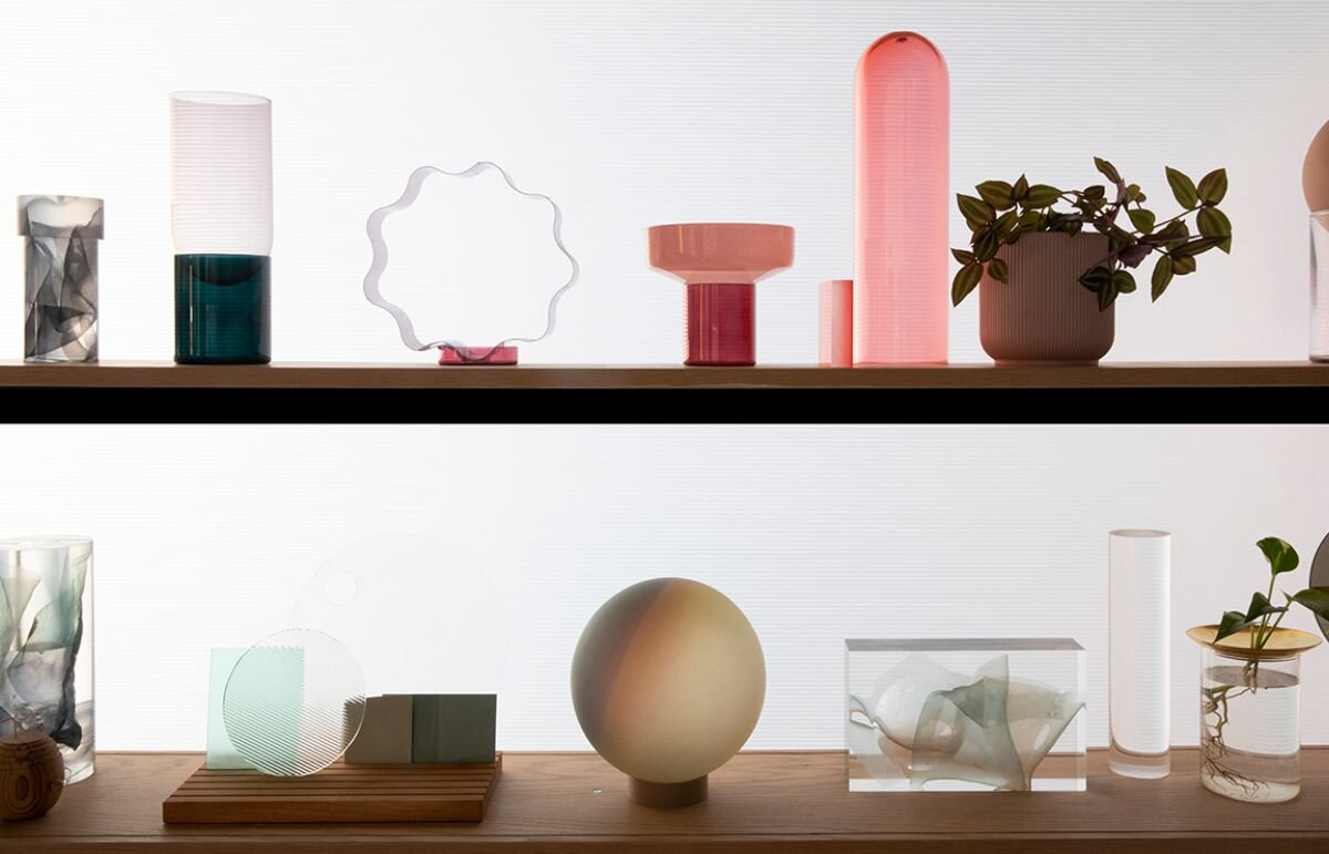
Everyday we walk into our studio surrounded by a rich mosaic of bits and bobs loosely composed on open shelves - objects that have caught our eyes by speaking to our souls: 

a weather-worn brick found on a Brooklyn street.
a finely machined piece of solid metal.
a shiny piece of handmade art glass.
an elegantly-shaped tree bough found in the woods.
etc.

At once mundane and magical, such matters are the building blocks of our products and a core part of our design approach.  Our practice is built on a commitment to elevating the elemental beauty of materials independent of their perceived values.  For this reason, our eclectic shelves are a critical instigator of our creative process.

Photo: L&G Studio

Photo: L&G Studio

While our shelves are often the starting point, the real magical moment is when a material's voice collides with ours.  When pondering what made it 'speak' to us in the first place, we often find ourselves with more questions:

Where did it come from?
How was it made?
What makes it special? 

This inquiry begins to reveal clues on how we might be able to amplify, celebrate, or give function to the materials' inherent quality.  The inevitable question:

How can this magical material become a magical object?

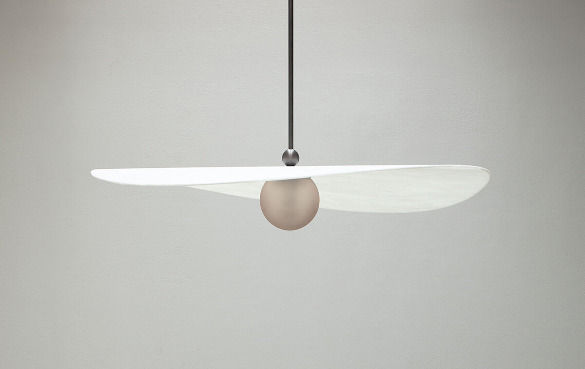
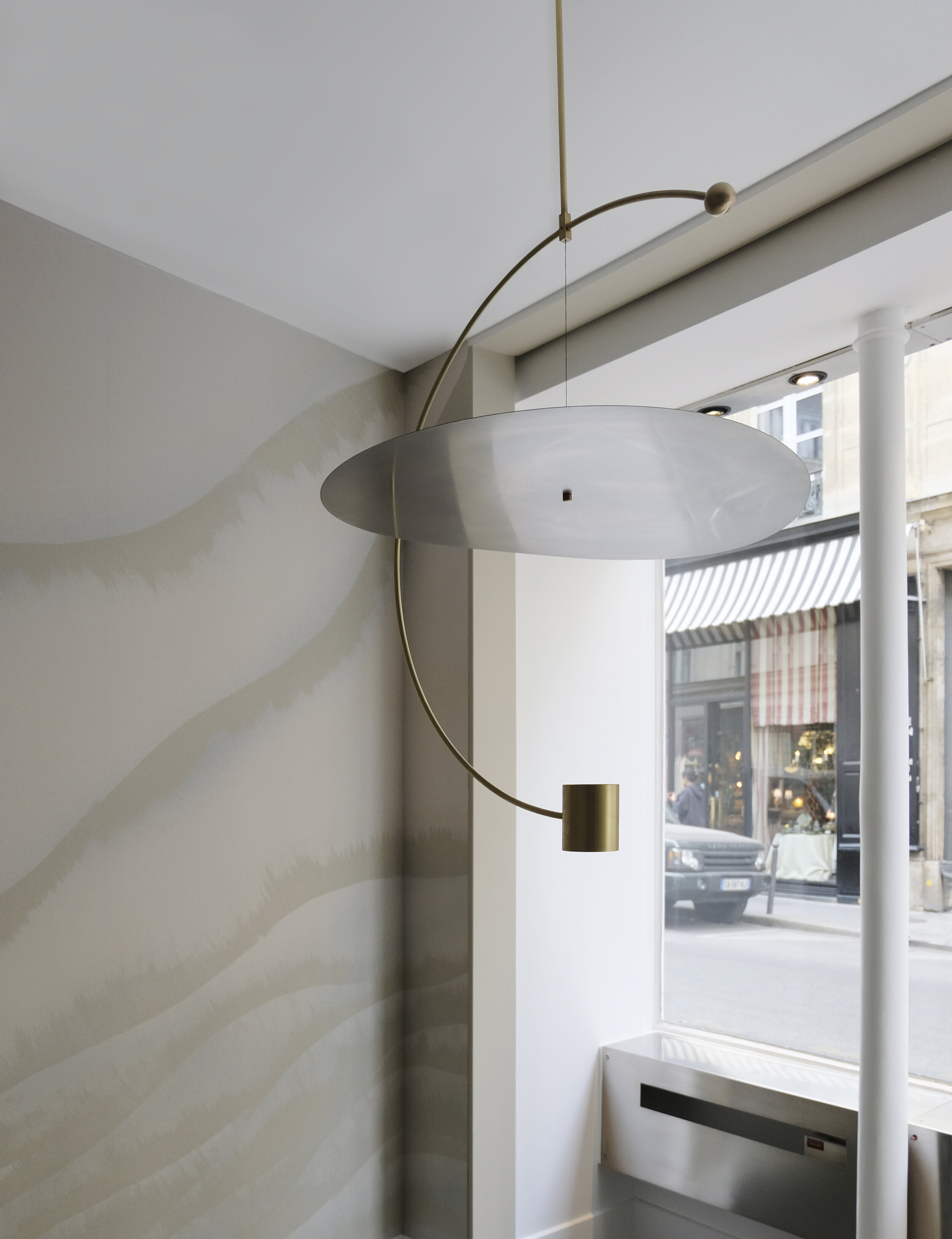
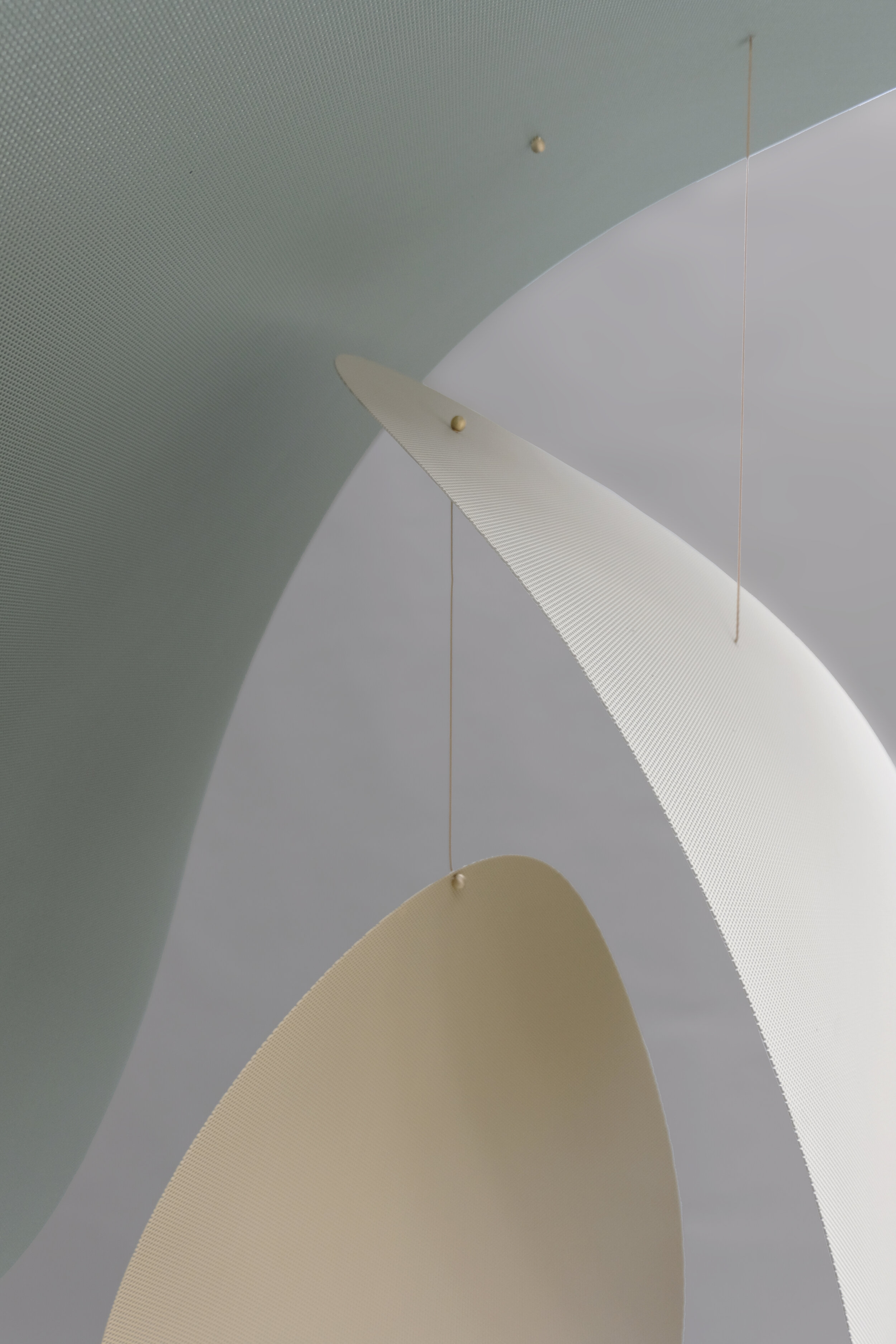
One recent exploration has delved into the simple but poetic possibilities of thin sheet materials.  Working from flat elemental shapes in metal and glass, we experimented with subtle manipulations that add structure and dimensionality to once 2D shapes.  Our Myrna shade was born from this process wherein an ellipse is given form by a single broad bend along a diagonal axis.  The result is a strikingly elegant gesture that defines space through form and light.

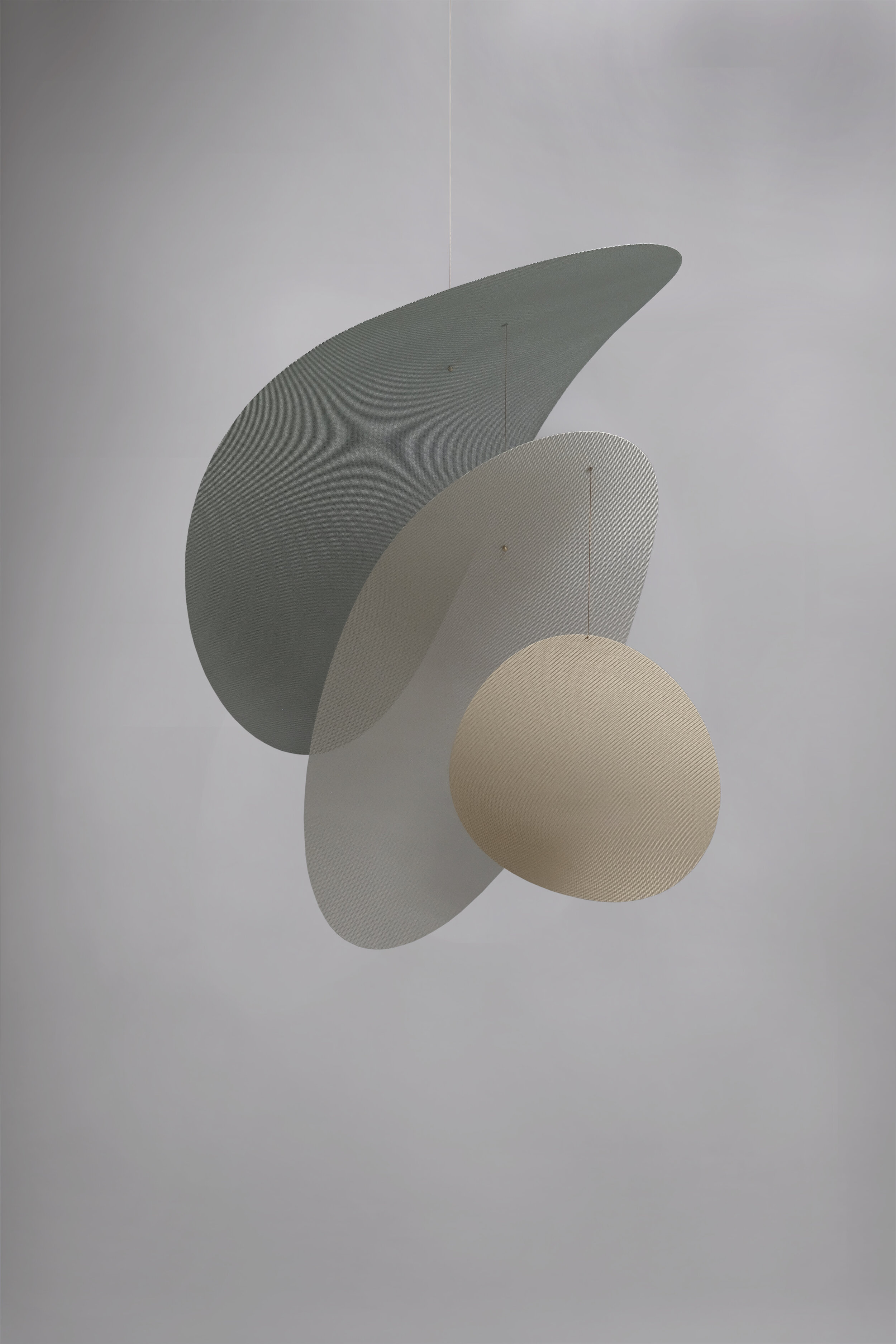
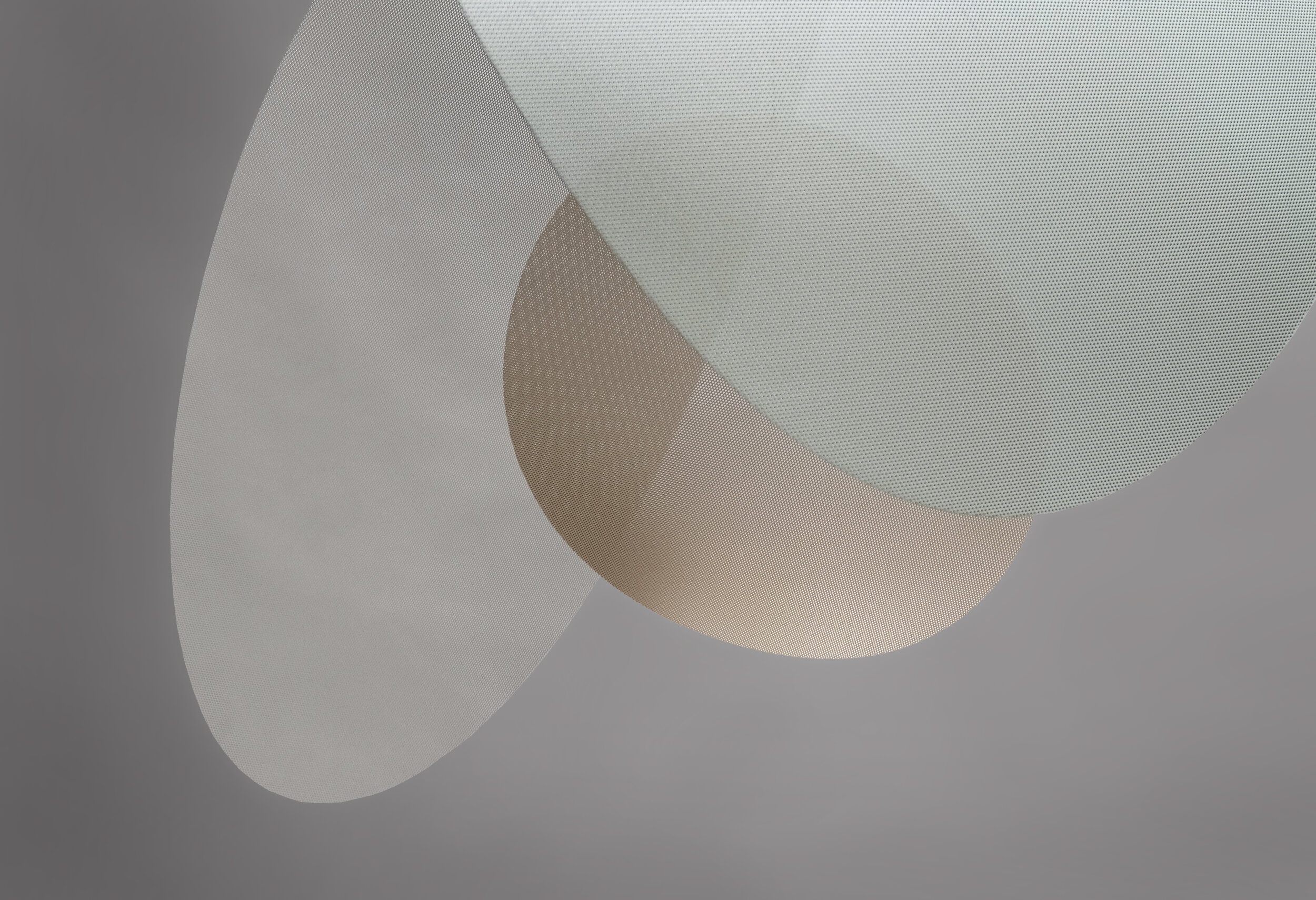
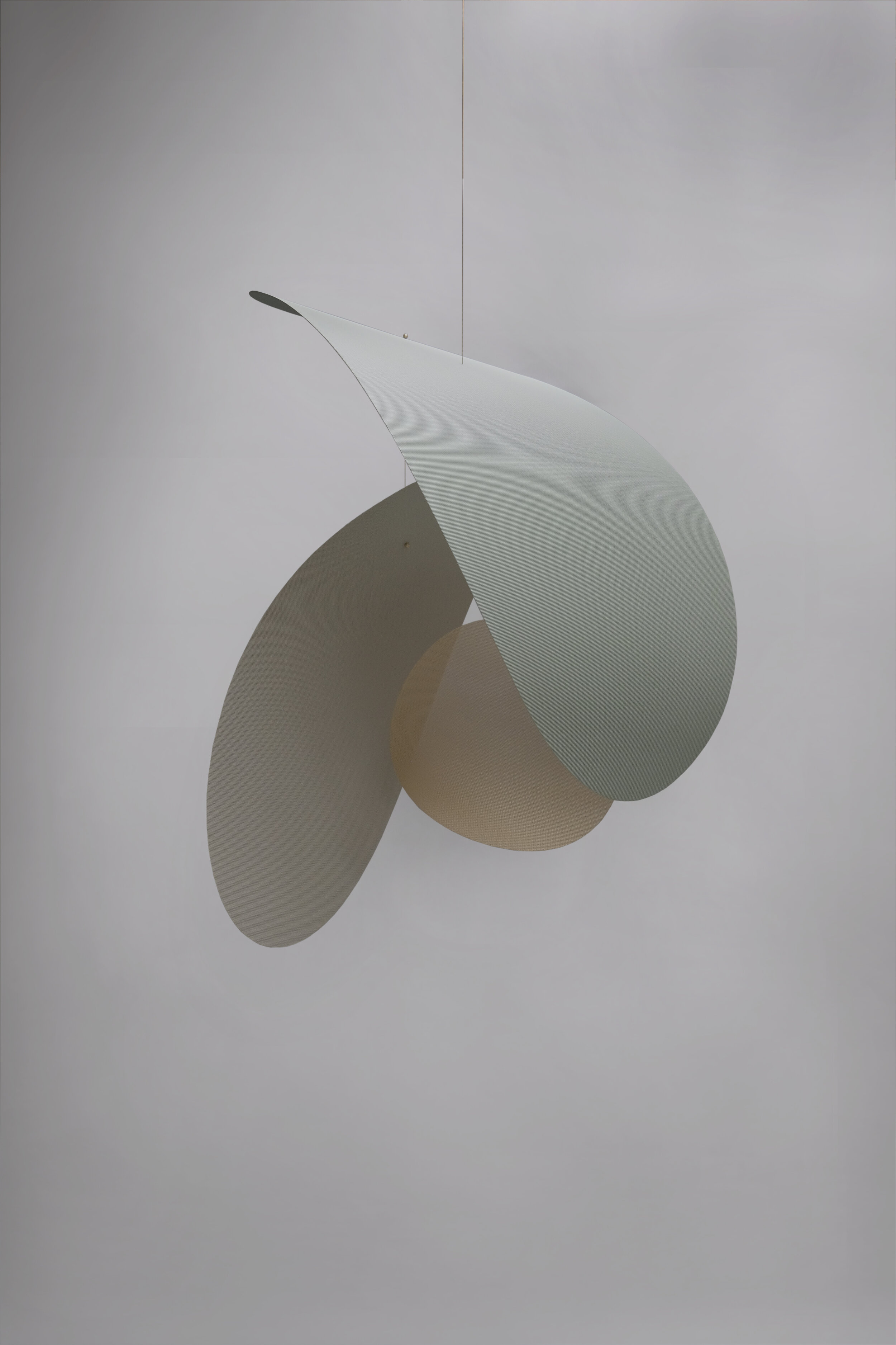
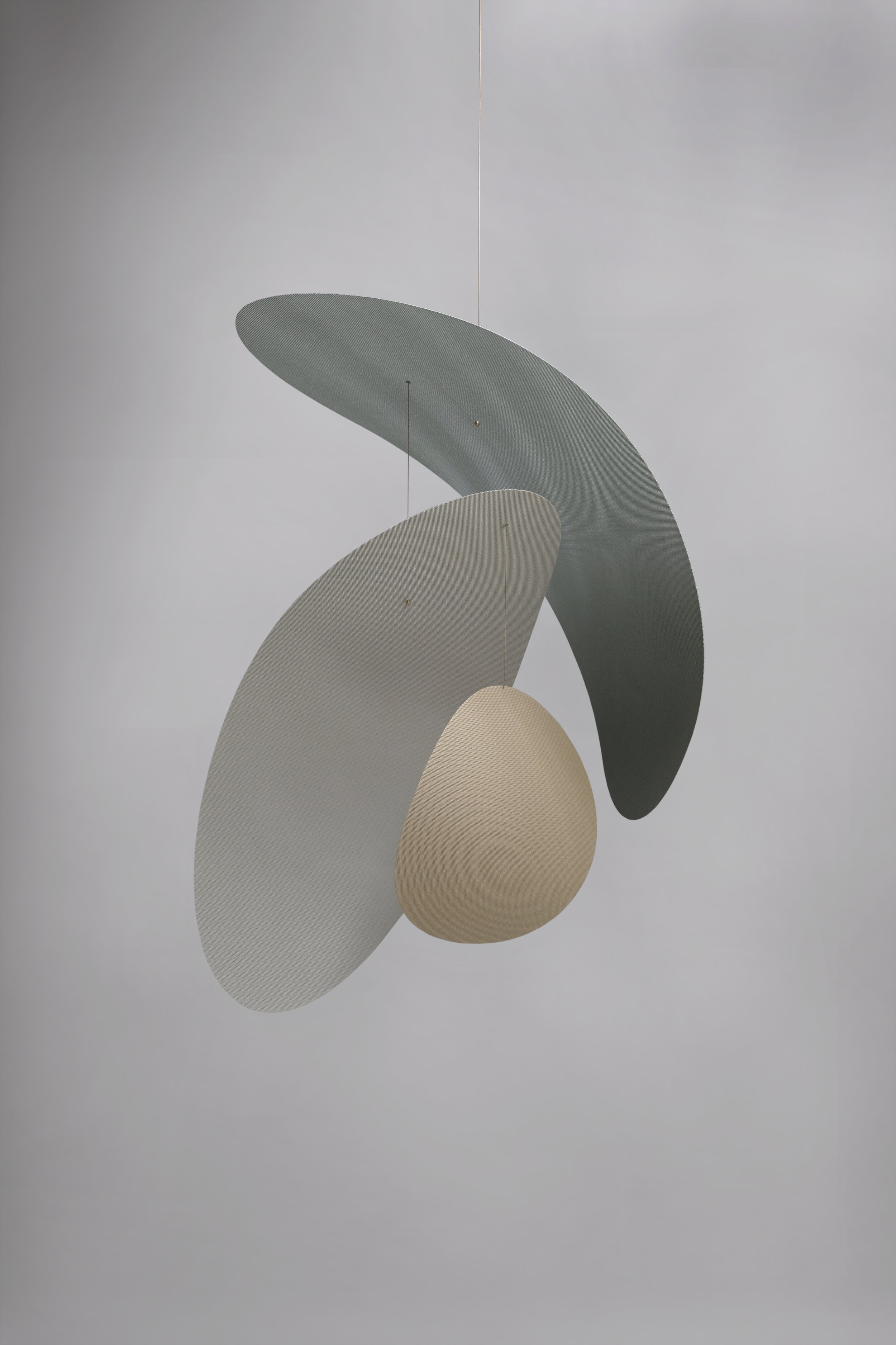
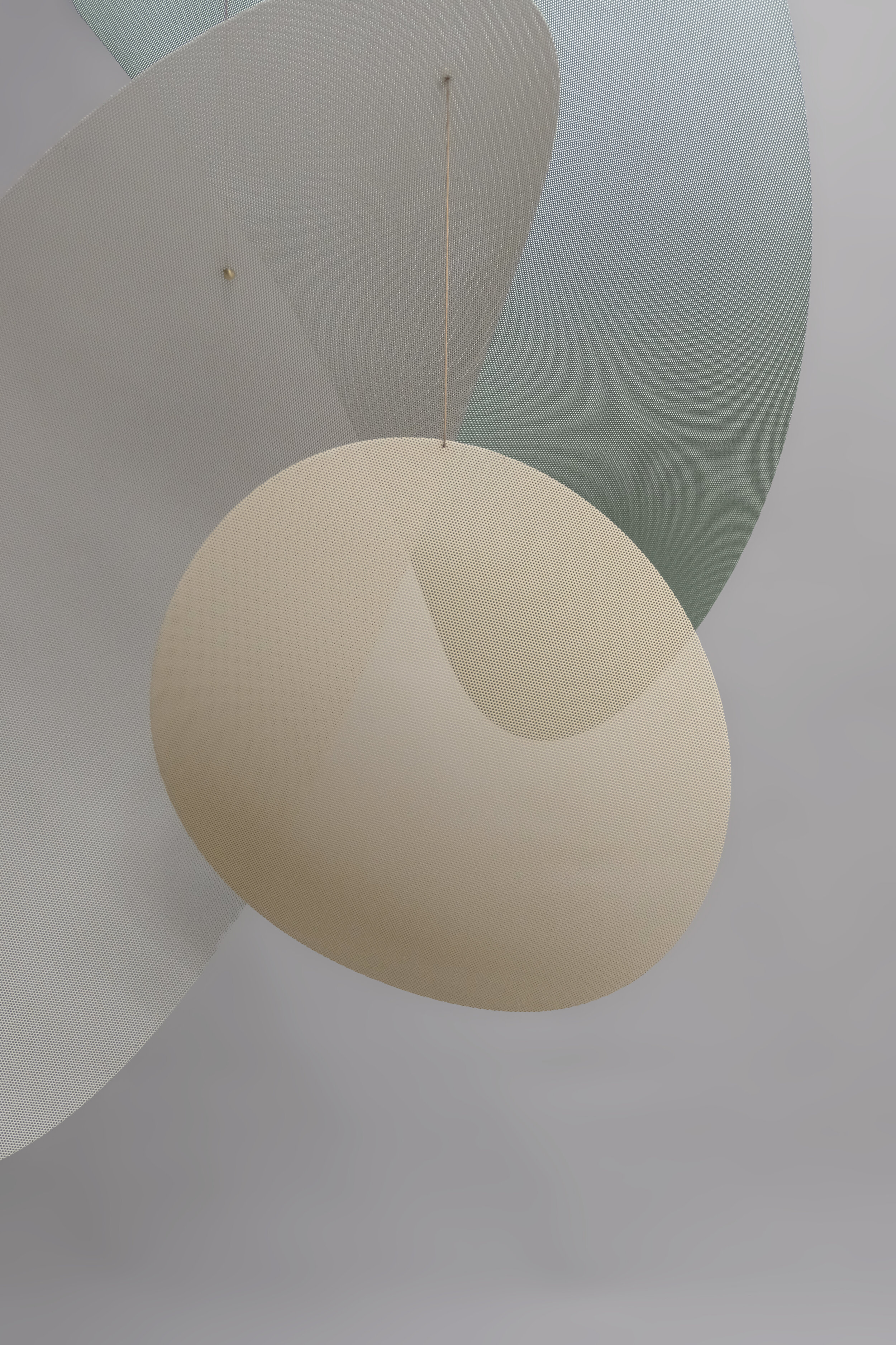
Furthering this exploration, the Moire Mobile takes a similar formal approach with perforated aluminum to reveal the simple magic of the perforation's semi-transparent characteristics.  

Another moment all together, we created an entire immersive material garden for Muji - an experience that allowed us to share the beauty of raw materials with the general public.

Photo: Charlie Schuck for L&G x Muji

Photo: Charlie Schuck for L&G x Muji

There's a story to every product and project we make - and we could go on and on.  However, we believe that such stories are best experienced in the process and outcome themselves, so we invite you to browse our collections while taking an extra minute to reflect on how material richness can enhance your particular space or life.  We're always happy to help advise on how best to optimize our products for your project's unique character.

Comment

Comment

Equalizer

Photo by Jonathan Hokklo, Installation by L&G Studio for Henrybuilt, 2019.

Photo by Jonathan Hokklo, Installation by L&G Studio for Henrybuilt, 2019.

We believe in the power of lighting to work with the whole of a room's architecture to create quietly enriching spaces to spend time in. 
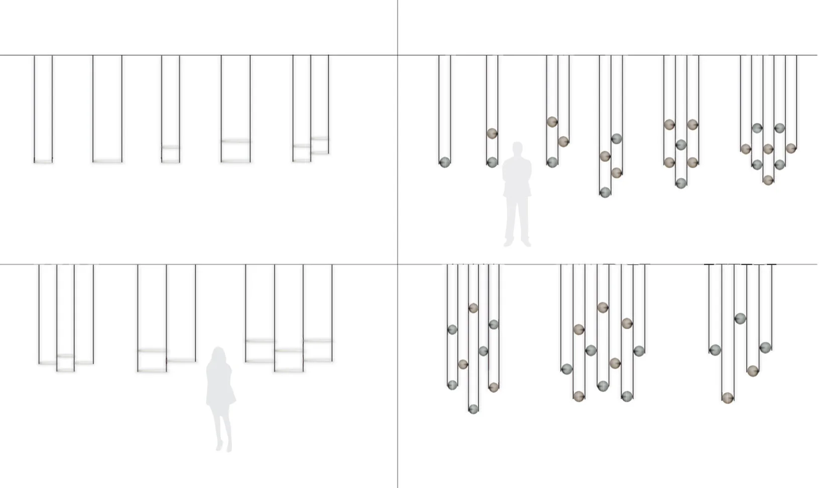
In this spirit, we asked how lighting might be used to delineate space instead of walls or structure.  With contemporary spaces becoming more open and free-flowing, there is still a need to define zones visually and functionally.  With this need in mind, we imagined an expandable illuminated framework to respond to different interior conditions.  Equalizer was born here as a series of illuminated shapes connected by a lightweight vertical structure.

Photo by Brooke Holm, Space designed by L&G Studio for SP01, 2016.

Photo by Brooke Holm, Space designed by L&G Studio for SP01, 2016.

photo by Lauren Colman, Interior Designer Michael Yarinsky, 2015.

photo by Lauren Colman, Interior Designer Michael Yarinsky, 2015.

Comprised of a system of versatile modular fittings, we're able to create an expansive array of configurations from simple pendants to custom screens that undulate through spaces like room dividers.  This flexibility enables a high degree of spatial integration created in collaboration with our clients.  The results yield beautiful decorative lighting that is carefully tailored to fit the space's character and functional needs - able to fall anywhere on the spectrum from an immersive asymmetrical sculpture to a symmetrical repeating pattern.  

photo by Lauren Colman, Installation at The Future Perfect in 2016

photo by Lauren Colman, Installation at The Future Perfect in 2016

The Equalizer collection is crafted from finely machined anodized aluminum fittings and paired with handblown glass globes by our close collaborator John Hogan, based in Seattle.  The glass is given a satin luster that emits a soft velvety glow when illuminated.  

Additionally, this collection exclusively offers the Chameleon color way, a special glass effect developed by Hogan.  The subtle gradient creates a mysterious yet magical color changing effect that shifts from sky blue to sunset pinks depending on surrounding light and viewing angle.  It's a very special option that speaks to our obsession with material wonderment and the beauty of glass in general.  

photo by Lauren Colman (left), photo by L&G Studio (right)

The Equalizer series is designed with versatility in mind, so it can be easily customized and configured in infinite ways based on the context and needs. So check out below to get a glimpse of what is possible!  

Comment

Comment

Krane / A collaborative collection

photo by Roll & Hill

photo by Roll & Hill

One of the amazing things about working in New York City is the incredible ways in which the world intersects here.  As cliche as it is, the melting pot effect is real and an important ingredient of the creative vitality that manifests in magical, dynamic, and unexpected moments large and small.  We find this so inspiring and why we were thrilled when one such moment crossed our paths shortly after landing here.

In 2016, our good friends at the Norwegian Consulate and Sight Unseen came with a casual invitation:  collaborate with Norwegian Designers to create an object that represents the overlap of culture and the exchange of ideas.  Always up for a collaborative opportunity, we jumped at the chance and were promptly connected with Vera & Kyte of Bergen, Norway. 

Working over long distance via email and phone conference, we came to discover our Pacific Northwest roots are closely entangled with Nordic influences.  Our conversations flowed and enlightened in unexpected ways considering we'd never met each other before.  Our group discussions touched on culture and values and were inevitably framed by the idea of light.  We learned Norway has a special intimate relationship with light due to their dark winters and long summers.  We also discussed the way design is valued differently in Scandinavia, where appreciation is much broader, ubiquitous, and accessible than in the US.  As we started to ideate, our concepts galvanized around the idea of creating a lamp that reflects this in an elegant and interactive way.

Through iterative sketches, we honed a collective design that became Krane.

photo by Roll & Hill

photo by Roll & Hill

photo by Roll & Hill

photo by Roll & Hill

The essential idea behind Krane is to create an intersection between a permanent, decorative light and a functional, portable lamp meant to adapt to spaces and needs.  Instead of an expressive chandelier that sits in one position like a sculpture, we pared down a lamp into essential elements that illicit an interaction between the user and the light.   

Krane's cord, armature, and light source all work together to create a simple expressive composition while providing users with the ability to move the light source closer or farther away with a single motion.  One Krane can go from illuminating a dining table to an intimate reading lamp simply by changing its height.  Its simple form can be installed in a variety of spaces without too much visual noise or expression.

Krane is available as a plug-in ceiling mounted fixture in two armature sizes (large and small) as well as a hardwired wall-mounted sconce version. 

Krane is manufactured by Roll & Hill, who provide an amazing level of craft, finish, and technical refinement to the series alongside its illustrious collection of contemporary lighting.

Comment

Comment

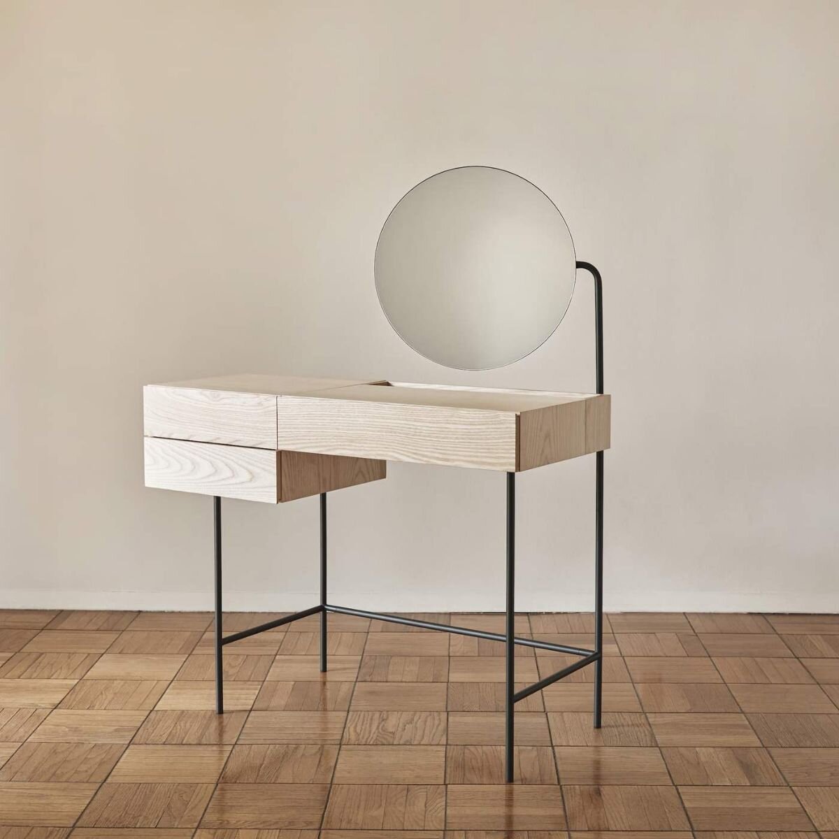
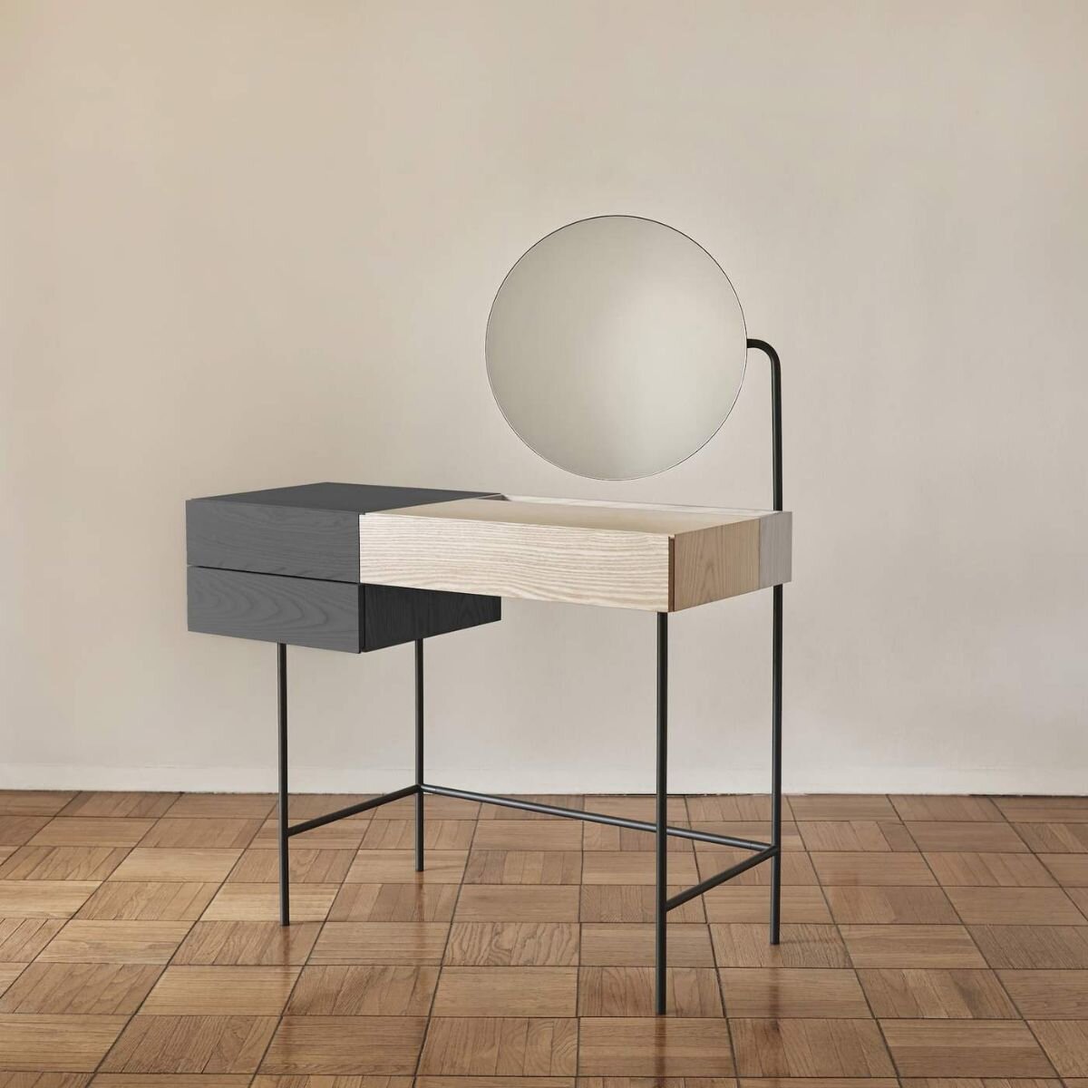
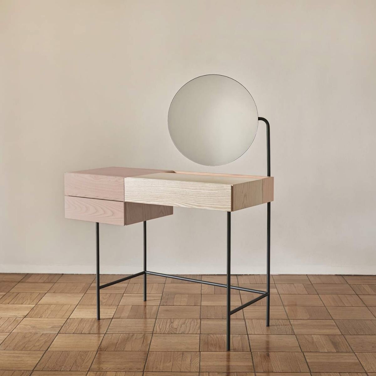
Composed / Dims Vanity Desk

We're thrilled to announce our new vanity desk we design for furniture brand, Dims.

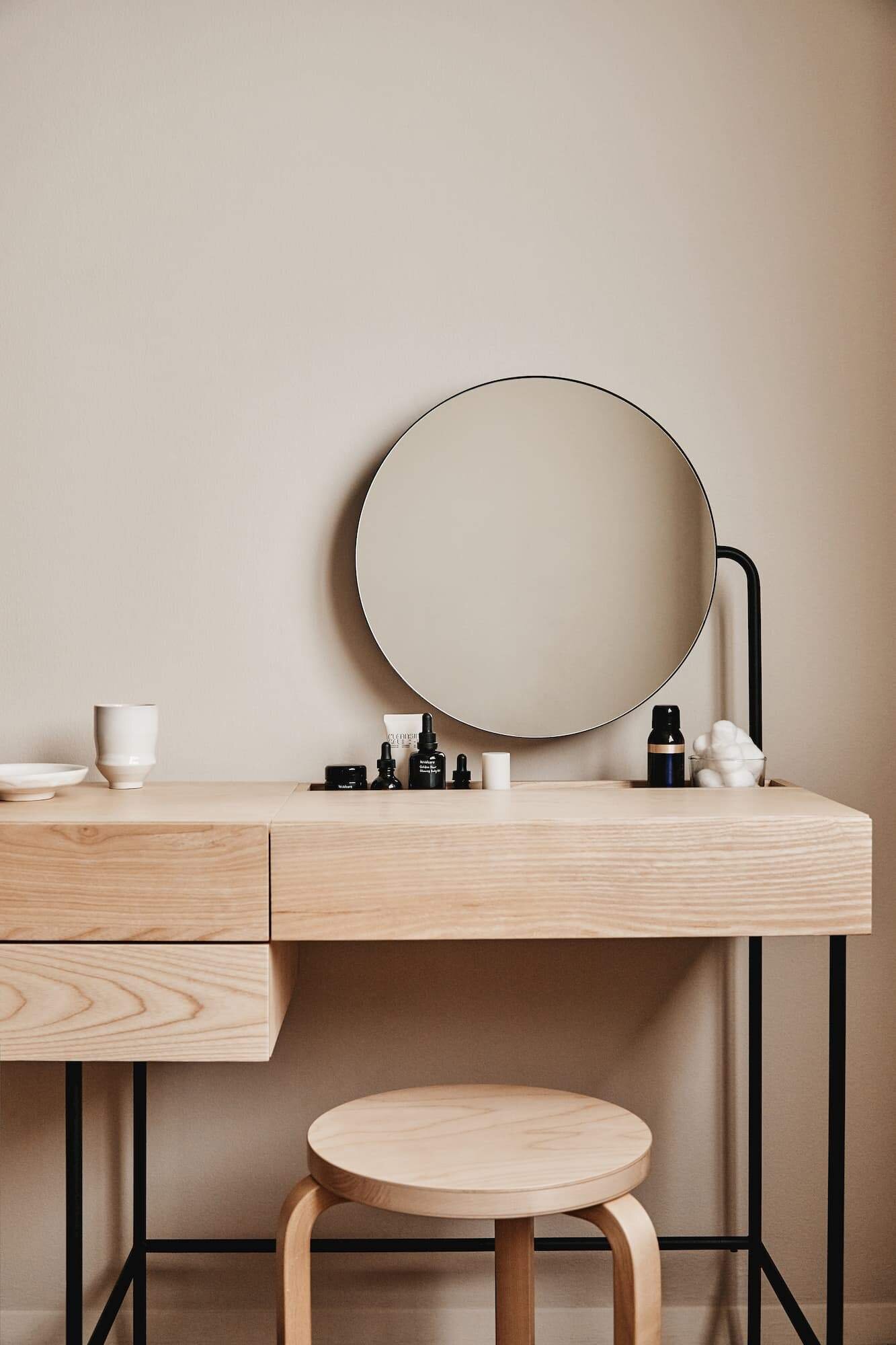
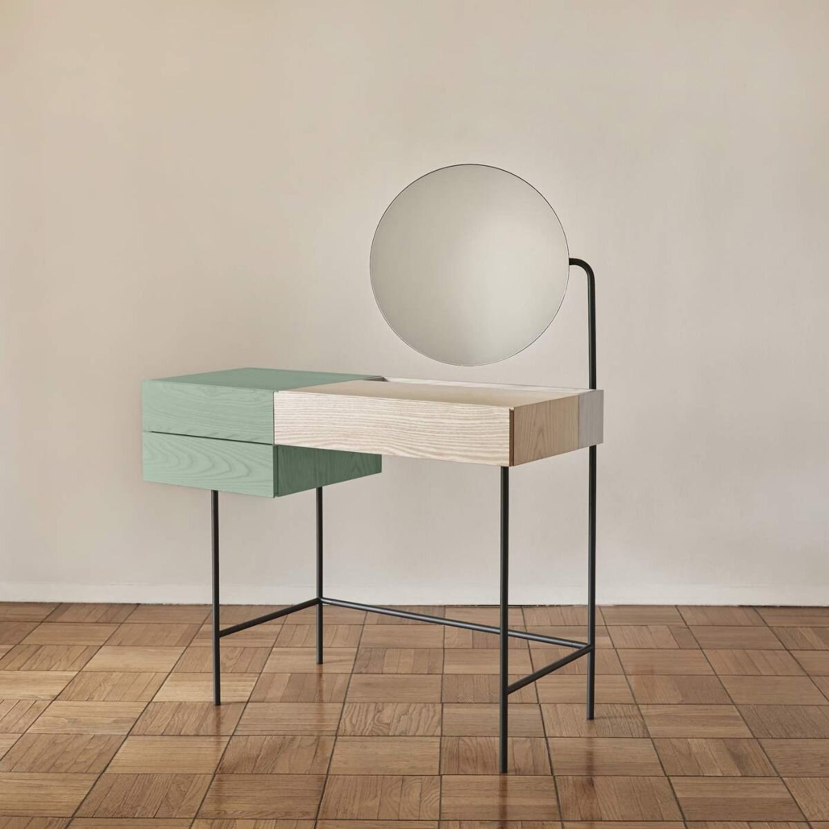
'Composed' Vanity desk began with a simple question:  how can a vanity be reimagined as a platform for healthy rituals around self-care?  We imagined a place where one does more than dress themselves up but rather nurtures themselves physically and mentally as a daily wellness ritual integrated into contemporary life.  
From this, our mission became clear - create a less vain vanity!

photo courtesy of Dims

photo courtesy of Dims

Our vision is to create a spot to take a break and focus for a moment on what makes one feel right and good.  We believe this requires a focused piece of furniture to fit its environment, so we set out to create a 'just-right' center for self-care with a set of simple, useful features:

  • Flexibility to be used as a desk or everyday storage surface in addition to a vanity.

  • A stature that doesn't consume too much space, but functions exceptionally.

  • Thoughtfully sized storage sized to hold everything from jewelry to jars to tall product bottles. 

  • A mirror size that isn't too dominating, adjustable, and removable to suit different conditions and preferences.

  • A simplified, contemporary form to fit a variety of interior styles.

photo courtesy of Dims

photo courtesy of Dims

Available in 4 color options with or without mirror on DIMS WEBSITE.

Comment

Comment

Paris Design Week 2019: Visions/Perceptions Exhibition at Triode Gallery

(Photo by L&G Studio)

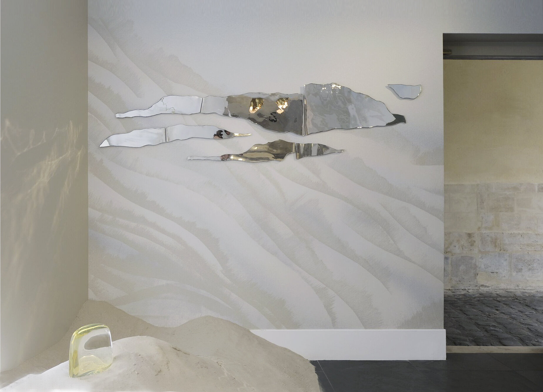
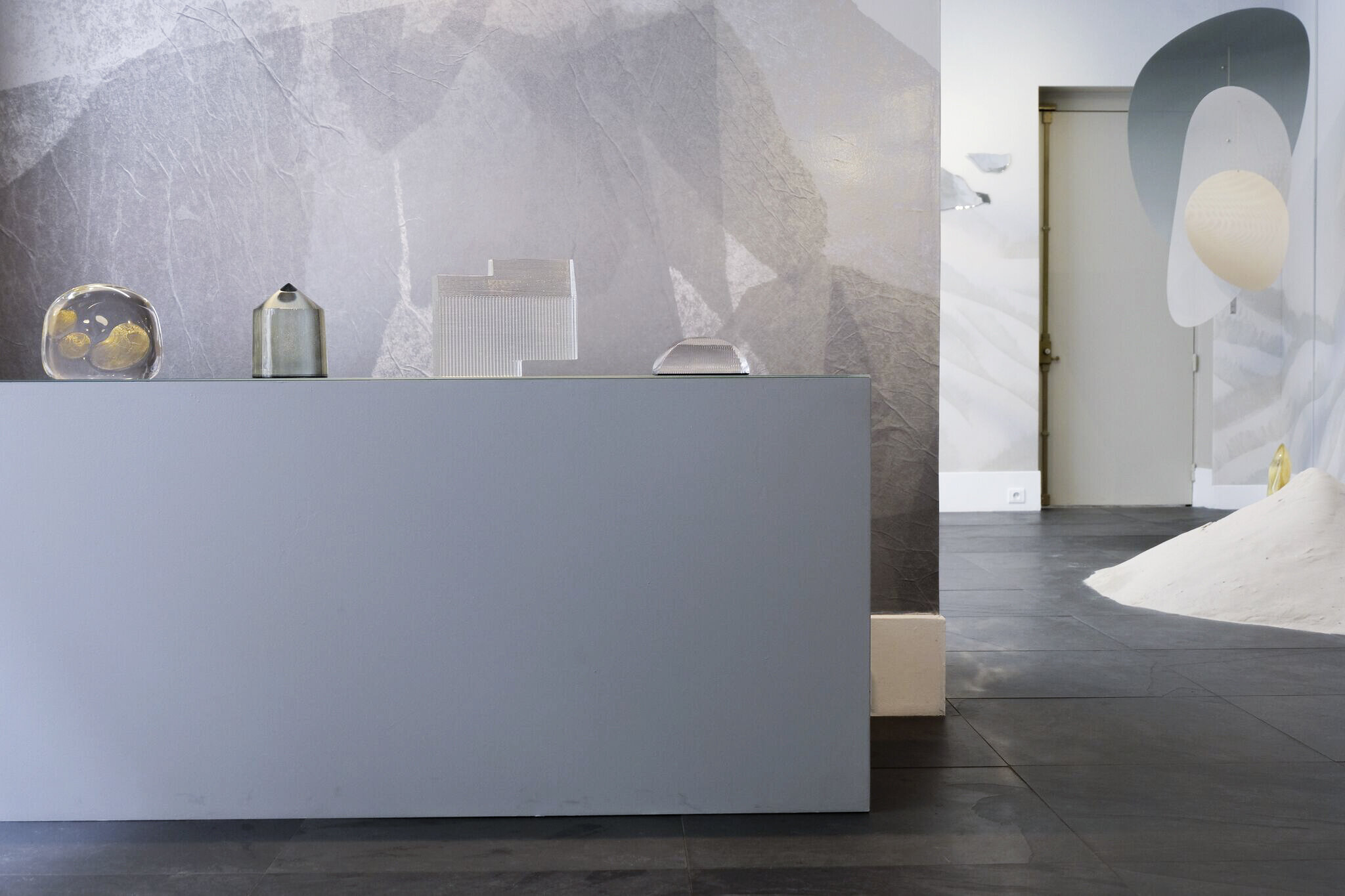
During 2019 Paris Design Week, Triode Design Galeri invited Ladies & Gentlemen Studio, Calico Wallpaper, and John Hogan to envision a collaborative exhibition express the spirit of each studio’s work. As long-time friends and collaborators, all three studios came together to explore the phenomena of illusory perceptions through a series of three distinct bodies of works installed in harmony to create an environment where material realities and optical illusions mingle.

Visions / Perceptions – was an installation designed by L&G in collaboration with Calico Wallpaper and John Hogan. The installation explores the connection between material realities and optical illusions through manipulating colors, materials, and surfaces. Calico Wallpaper introduces Singing Sand, capturing the mesmerizing patterns of an atmospheric phenomenon, John Hogan presents works in glass which play with our biological responses to sensory distortion, and Ladies & Gentlemen Studio explores the ambiguity of light and shadow through a new conceptual kinetic sculpture and lights.

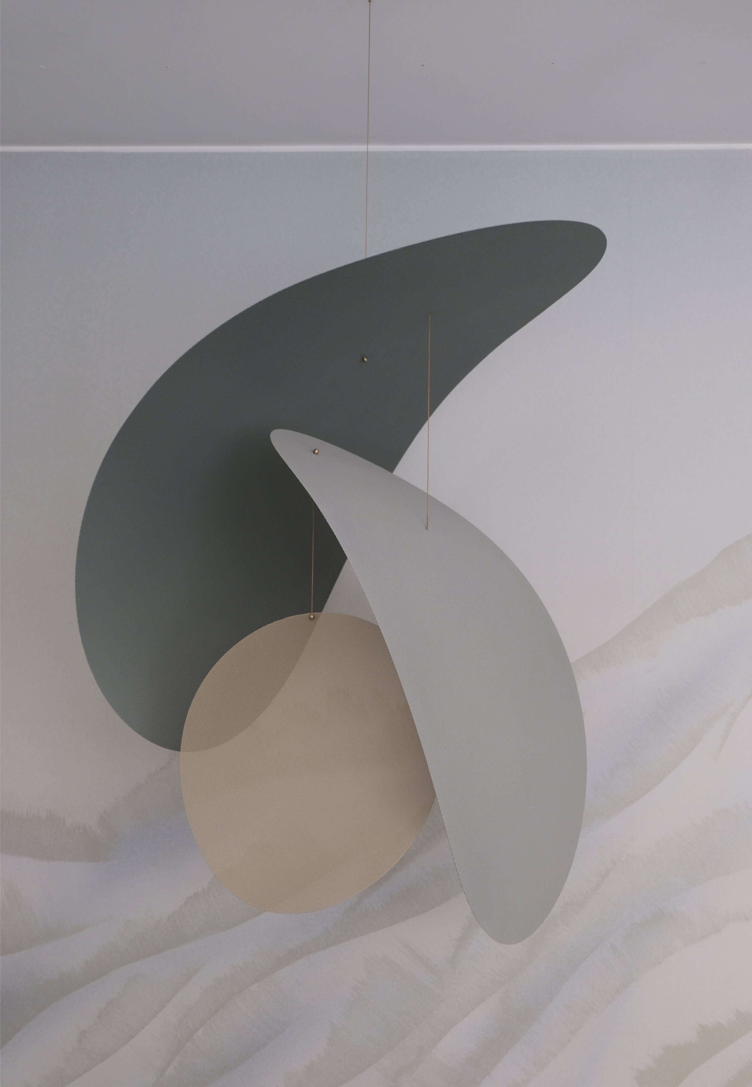
An iteration of L&G's past kinetic works, the studio launched Moire, a kinetic mobile that explores new dimensions of optical material effects using bent perforated sheet metal. Through an assemblage of overlapping organic shapes, a smoothly shifting composition insects with the surrounding environment revealing a complex undulation of geometries that alternate between obscured and transparent materiality. The exploration speaks to L&G's fascination with revealing the inherent qualities of ubiquitous materials in unexpected ways - here employing sheet metal to an effect that defies its typical heaviness in favor of airy lightness. The resulting effect is reminiscent of starling murmurations across a twilit horizon. Moire is an editioned series crafted by L&G Studio at their Brooklyn studio. Custom sizes, colors, and variations available on a commission basis.

1.jpg

Comment

Comment

Happy Summer

As the mid-year mark has come and gone, we're pausing to take a minute to reflect on some moments of wonderment from the year's experiences so far. 

2019 has brought some amazing opportunities to further explore and expand upon our vision for designing with thoughtful curiosity.  In this spirit, we want to thank you for being a part of the journey as we share some great moments!

Photo: L&G Studio

Photo: L&G Studio


JANUARY

INTERVIEW - WITH FERNANDO MASTRANGELO
We sat down with the talented Brooklyn-based designer, Fernando Mastrangelo, to speak about how we started, our process & approach, and our studio's evolution on Fernando's web channel, The Path. 
>> WATCH VIDEO HERE

PRODUCT LAUNCH -  ISO  
We debuted a new lighting series, Iso, a versatile plug-in swing arm lamp that brings expressive overhead light to spaces without electrical boxes.
>> LEARN MORE HERE 


FEBRUARY

EXHIBITION -  1stDIBS GALLERY 
As newcomers to the 1stDibs platform, we were honored to have a guest popup space in the grand opening of their Manhattan gallery. 
>> READ MORE HERE

WORKSHOP - MODERNISM IN THE MIDWEST  
As organizers/curators of Furnishing Utopia, we ventured out to the Midwest spending 5 days exploring the utopian ideals at the root of American Modernist and reflected on how this visionary period has impacted design and our everyday life. 
>> READ MORE HERE


MARCH

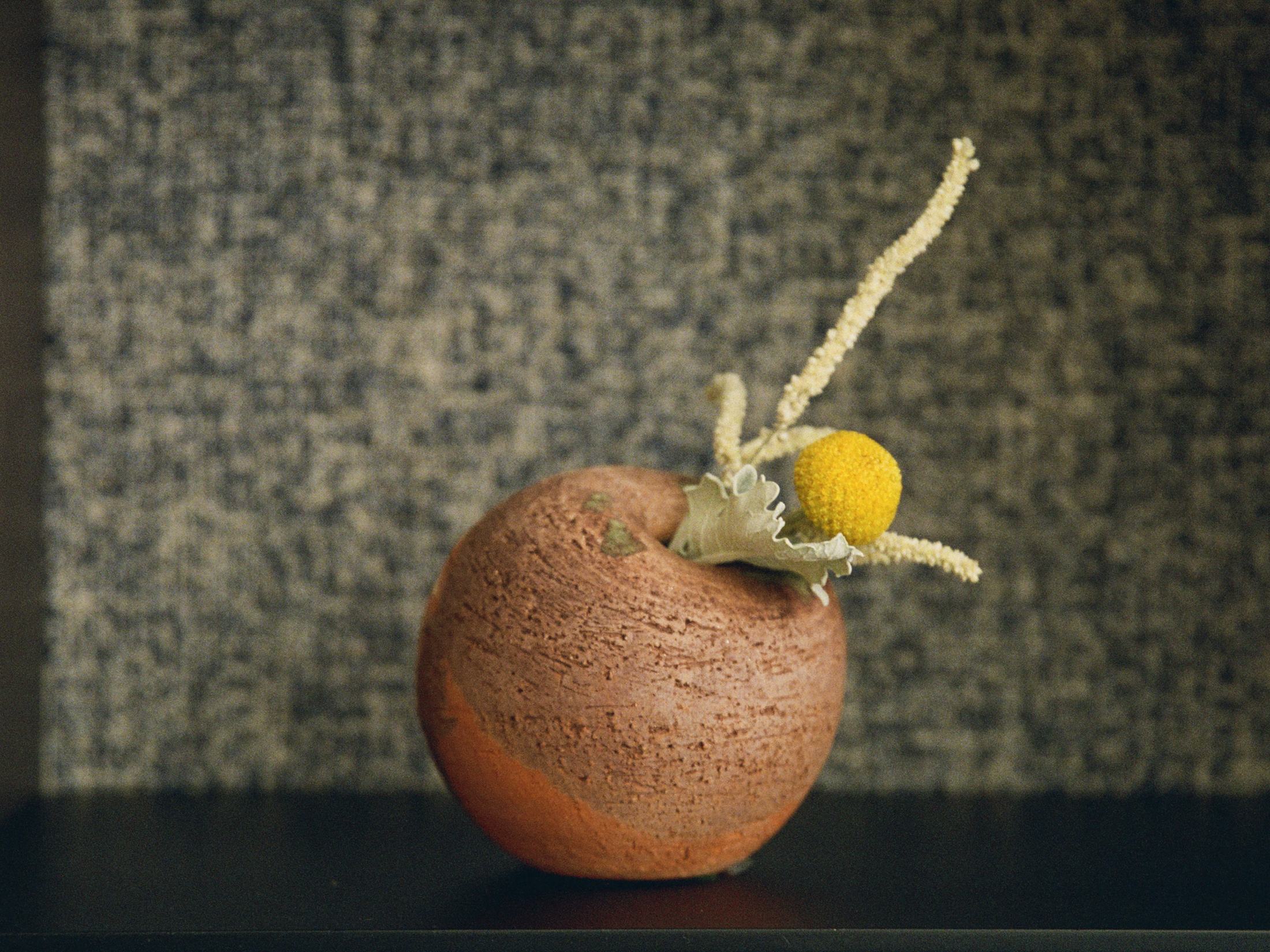
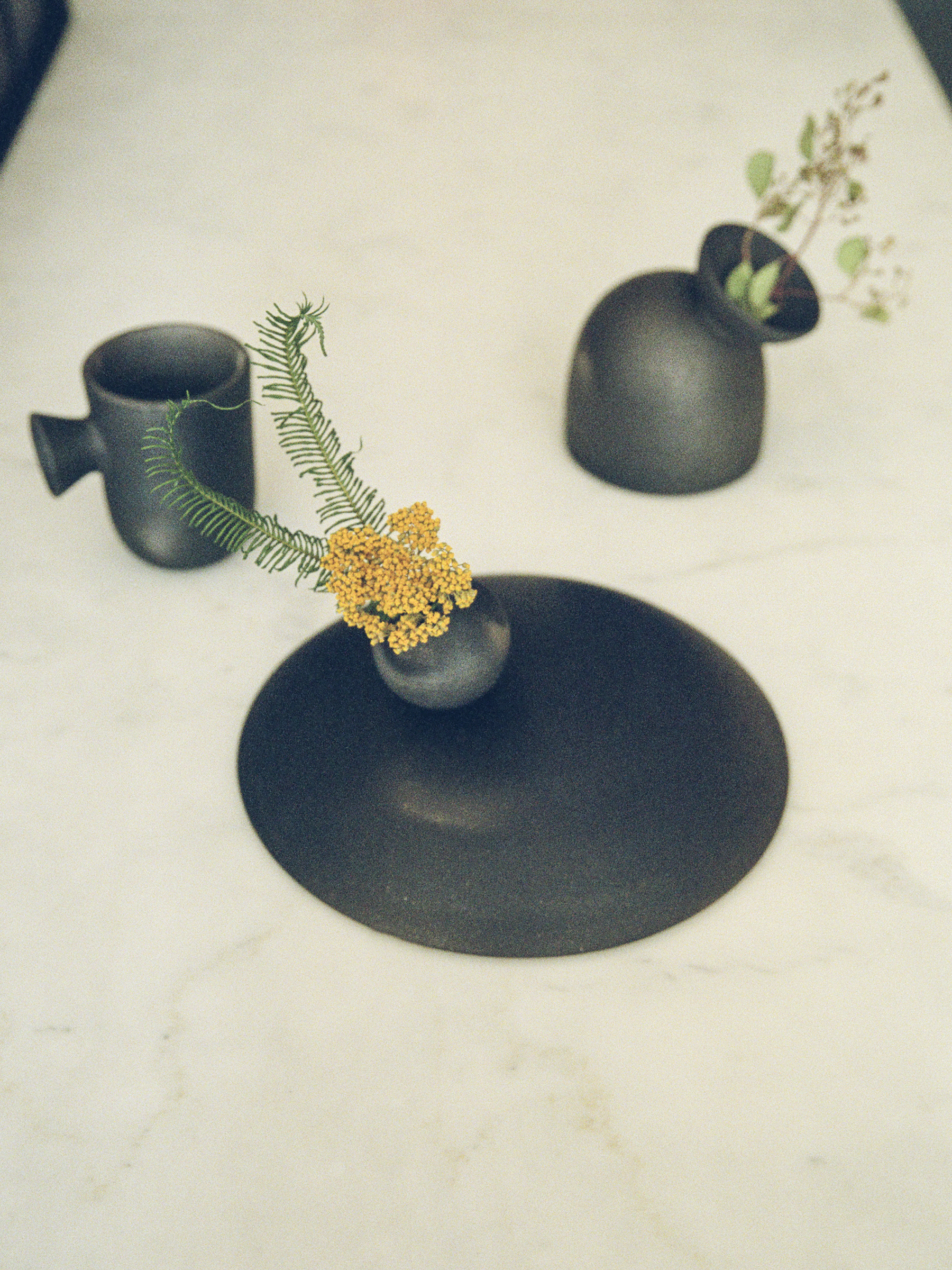
Product: Myrna Pendant / Photo: Michael Yarinsky Product: Ikabana Base / Photo: Charlie Schuck

PROJECTS - CEDAR RESIDENCE  
Honored to be part of a lovely project in Orient, NY by dear friend and architect Michael Yarinsky, who prominently used L&G lighting throughout the project to beautiful results! 
>> READ MORE HERE 

COLLABORATIONS - KAAREM x CHARLIE SCHUCK
Some collaborations are so strong, they endure over multiple iterations.  Such is the case here as we creatively revisit and expand on past ideas with two of our favorite repeat collaborators - Kaarem and Charlie Schuck
>> READ MORE HERE  


APRIL

EXHIBITION - MILAN DESIGN WEEK
We teamed up with Calico Wallpaper and Mud Australia to create a collaborative exhibit focused on our collective embrace of craft, process, and simplicity.  It was our first official exhibition in Milan and  also marked the debut of our Myrna lighting series.  
>> READ MORE HERE 
 
WORKSHOP - ORIGIN IN PORTO 
We ventured to Portugal to participate in a 4-day workshop focused on the country's rich artisan culture, hosted by the new bespoke brand Origin founded by designer Gabriel Tan.  The result was our Salt series, a collection of beautifully textured vases using metallic salts in the firing process to create naturally varied colors and textures.
>> READ MORE HERE 


MAY

HenrybuiltEXHIBITION - COMMON GROUND AT HENRYBUILT NY 
A homecoming event of sorts as we joined up with Henrybuilt to explore the legacy and values we collectively strive towards (Dylan and Jean both worked with Henrybuilt in Seattle prior to starting L&G).  The exhibit featured select works by L&G juxtaposed thoughtfully with Henrybuilt's systems and furniture along with curated Origin accessories. Our lighting will remain on view through September 31st. 
>> READ MORE HERE  

EXHIBITION - FURNISHING UTOPIA 4.0 AT HERMAN MILLER  
This 4th iteration of Furnishing Utopia ushered in a new focus - the roots of American Modernism.  The exhibition entitled 'Drawing Upon Frameworks' featured a curation of drawings by the design collective on view at Herman Miller's NYC flagship through September 31st. 
>> READ MORE HERE


JUNE

PRODUCT LAUNCH - L&G X POKETO ISOMETRIC NOTEBOOK
We're excited to launch our first stationery product with our good friends at Poketo!  We designed a notebook to (re)introduce the use of the isometric grid for ideating and doodling. The Isometric notebook is available in Dusty Rose or Sage.
>> READ MORE HERE

FEATURE - L&G STUDIO IN POKETO BOOK
We're incredibly thrilled to be included in Poketo Founder's new book, 'Creative Spaces' a celebration of creatives, their work, and their spaces.  Featuring our studio 25+ other creatives from all around North America.   
>> ORDER A COPY HERE 


Comment

Comment

L&G x Henrybuilt: Common Ground installation during NYC x Design

During 2019 NYCxDESIGN through September, Henrybuilt present Common Ground, a showroom installation by Dylan Davis and Jean Lee of Ladies & Gentlemen Studio, who conceived the show based on their history working with Henrybuilt and the resulting overlap of the two brands’ values, references, and methodologies.  Ladies & Gentlemen will be featuring new lighting and styled vignettes with object by Origin throughout the gallery space, responding to the Henrybuilt system’s elegant functionality by complementing it with organic forms and soft materiality.  

Common Ground will mark a reconnection of the two brands’ creative roots that can be traced back to their beginnings in Seattle, Washington.  Davis, co-founder of Ladies & Gentlemen Studio began his design career as an intern at Henrybuilt in 2005.  Davis worked closely with founder Scott Hudson to articulate the foundational standards of Henrybuilt’s system.  Lee, Davis’s co-founder at Ladies & Gentlemen, was pivotal in the development of leather products for the company.  In addition to fostering significant growth for the Henrybuilt brand, their six-year working relationship provided Davis and Lee with the philosophical and practical knowledge upon which they based Ladies & Gentlemen Studio’s driving principles.  This installation will reflect this by highlighting the intersection of the brands’ work in shaping beautifully functional spaces that celebrate elegance and simplicity.

SEE PRESS FEATURES: Surface / Sight Unseen / Wallpaper

Comment

Comment

Myrna Collection

Photo by Ladies and Gentlemen Studio

Photo by Ladies and Gentlemen Studio

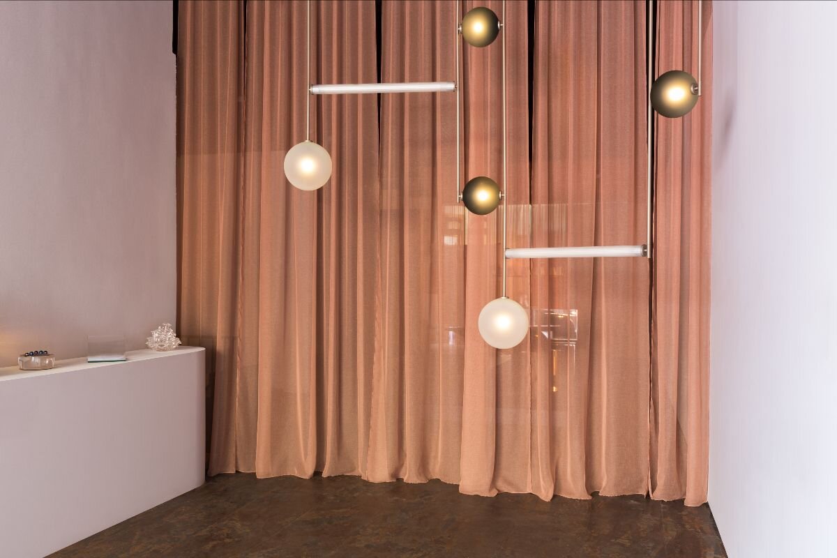
We're extremely excited to announce the launch of Myrna, a new collection using color, shape, and materiality to define intimate spaces through light. Embracing the naturally sinuous qualities of sheet materials, Myrna expresses simple, sculptural gestures that add warmth and dimension to interior volumes.   

Space by Giancarlo Valle, Photo by Stephen Kent

Space by Giancarlo Valle, Photo by Stephen Kent

Myrna stemmed from a collaborative commission from fellow designer Giancarlo Valle in 2018, when he came to us with an intriguing request:  challenge the traditional chandelier archetype while defining the dining space of his open loft home.  The result was the Myrna Wall Mobile, a gestural variation on a swing arm lamp, made from blackened brass, tinted glass, and an oversized oval shade made from perforated steel. The counterweighted armature allows flexibility in the light's position, creating a positionable warm, embracing cast of light over the designated area. 

Photo by Charlie Schuck

Photo by Charlie Schuck

Top left space by Michael Yarinsky, photo Hanna Grankvist. Top right photo by Ladies and Gentlemen Studio

Top left space by Michael Yarinsky, photo Hanna Grankvist. Top right photo by Ladies and Gentlemen Studio

Myrna's broad shade form is inspired by actress Myrna Loy's signature floppy hats, an elegantly strong and simple form created from a gently bent piece of sheet material.  The structured, but organic shape has a remarkable ability to create an embracing gesture within larger surroundings making it perfect for dining and sitting areas.  The shade also allows for an abundant array of material options from perforated aluminum, brass and stainless steel to a lovely bent glass, a process new to our studio.  Each glass shade is formed from uniquely patterned art glass sheets and given a velvety surface finish resulting in an intriguing materiality that's thin and translucent with a stone-like pattern and hand.

(Photos by Ladies and Gentlemen Studio)

Though Myrna has already found it's way into some beautiful new homes and spaces, the collection was officially launched last month in Milan, at our Still/Life exhibition during the Salone del Mobile (more on that to come!)

00a5e34c-96f4-47df-8016-e2f45ecb3e28.jpg

Myrna is available in an angle-adjustable pendant, sconce, ceiling-mount, and wall mobile format in a variety of materials.  The full scope of the collection can be explored via the link HERE.

Comment

Comment

Still / Life: L&G x Calico Wallpaper x MUD Exhibit in Milan 2019

hero_image_with text.jpg

L&G debuted at Milan during Salone del Mobile this year with Still / Life, an exhibit presented by Calico Wallpaper in collaboration with Mud Australia. A sensorial installation that offered guests a moment of introspection, interaction, and stillness, Still / Life featured site-specific gradients by Calico Wallpaper, interiors and lighting by Ladies & Gentlemen Studio, and ceramics by Mud Australia. The spatial concept designed by studio founders Dylan Davis and Jean Lee, envisioned a space that embraced a dual state of tranquility and vitality, revealing a calming yet enriching environment that opened the senses to elemental possibilities: a momentary day dream, a fond memory, or a chance conversation. The installation incorporated elements of process and materiality from the exhibitors as a means to celebrate their collective creative energy. The lighting collection Myrna, which uses color, shape, and materiality to define intimate spaces through light was launched at this occasion.

SEE PRESS MENTIONS: Elle Decor Italia / Surface / Design Anthology

CREDITS:

Collaborators: Calico Wallpaper / MUD Australia

Styling by: Jean Lee of L&G Studio

Photography by: Ladies & Gentlemen Studio / Lea Anouchinsky

Comment

Comment

L&G Lights in The Cedars Residence by Michael Yarinsky

Originally built in 1883, The Cedars sits between the bay and the sound, at the entrance to the quiet town of Orient, New York. Michael Yarinsky Studio worked with their client to create a beautiful and playfully decorated home, referencing the natural environment surrounding the property. L&G’s lighting is featured throughout, including the Myrna Pendant, Maru, Shape Up 3 Piece, Shape Up Globe, Spun Pendant and Aura.

Photography: Charlie Schuck

Comment

Comment

L&G x 1stDibs Gallery Opening

L&G made its 1st Dibs debut as invitational contemporary exhibitors in the newly-opened Chelsea showroom. The showroom exhibit displayed the studio’s latest lighting collections in abstracted living vignettes, seeking to convey the studio’s playfully austere vision of space where in lighting plays a critical role in defining an environment’s function and spirit.

SEE PRESS MENTIONS: Dezeen / Domino

Comment

Comment

Launching Iso Swing Arm Lights

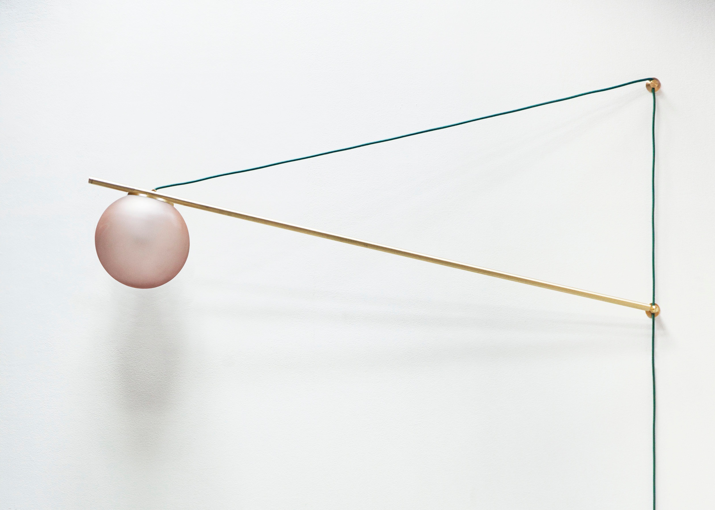
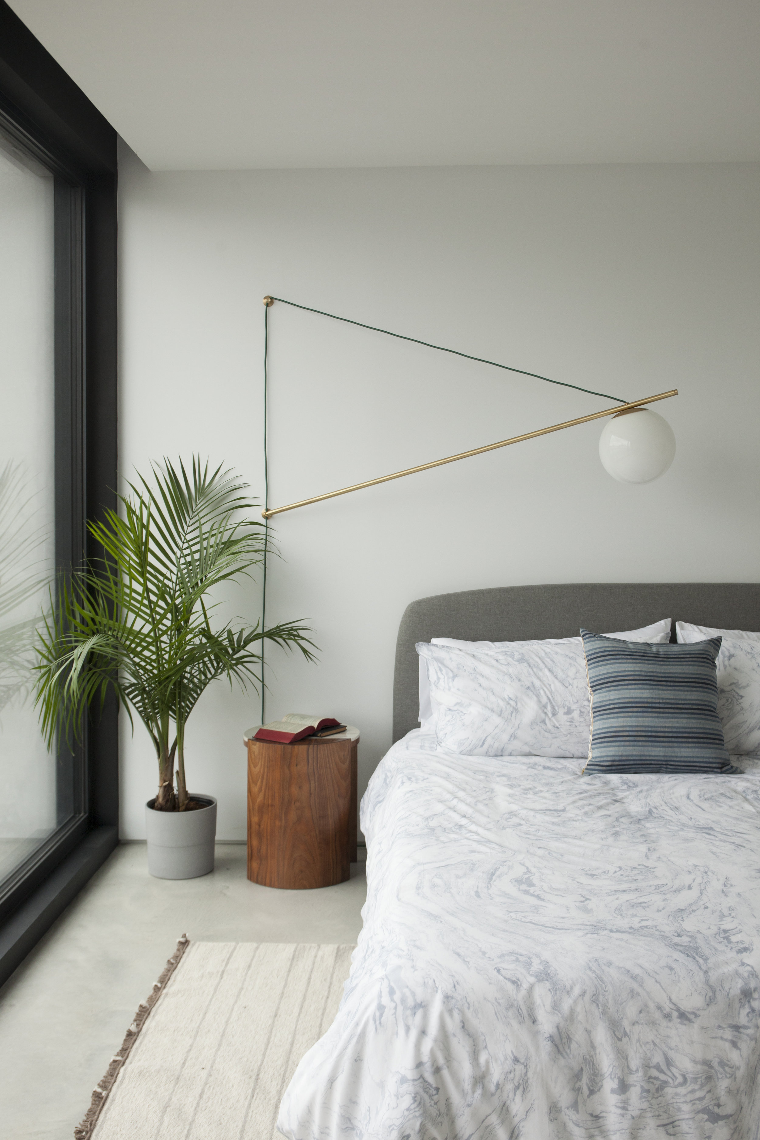
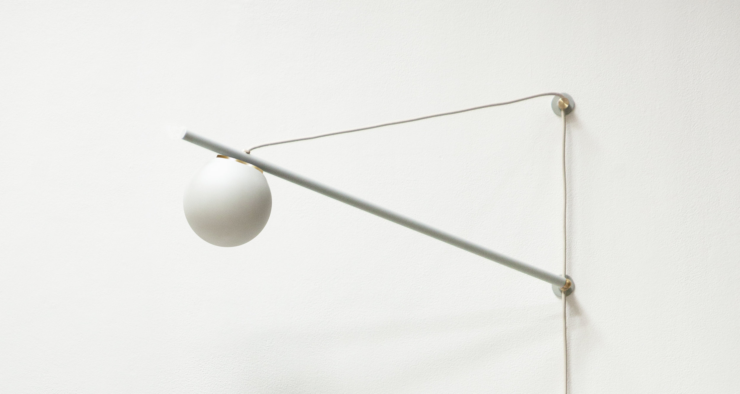
We’re really excited to share a new lighting series, name Iso. Iso began with consideration towards a common problem: how to create impactful, functional overhead lighting without a ceiling electrical box.

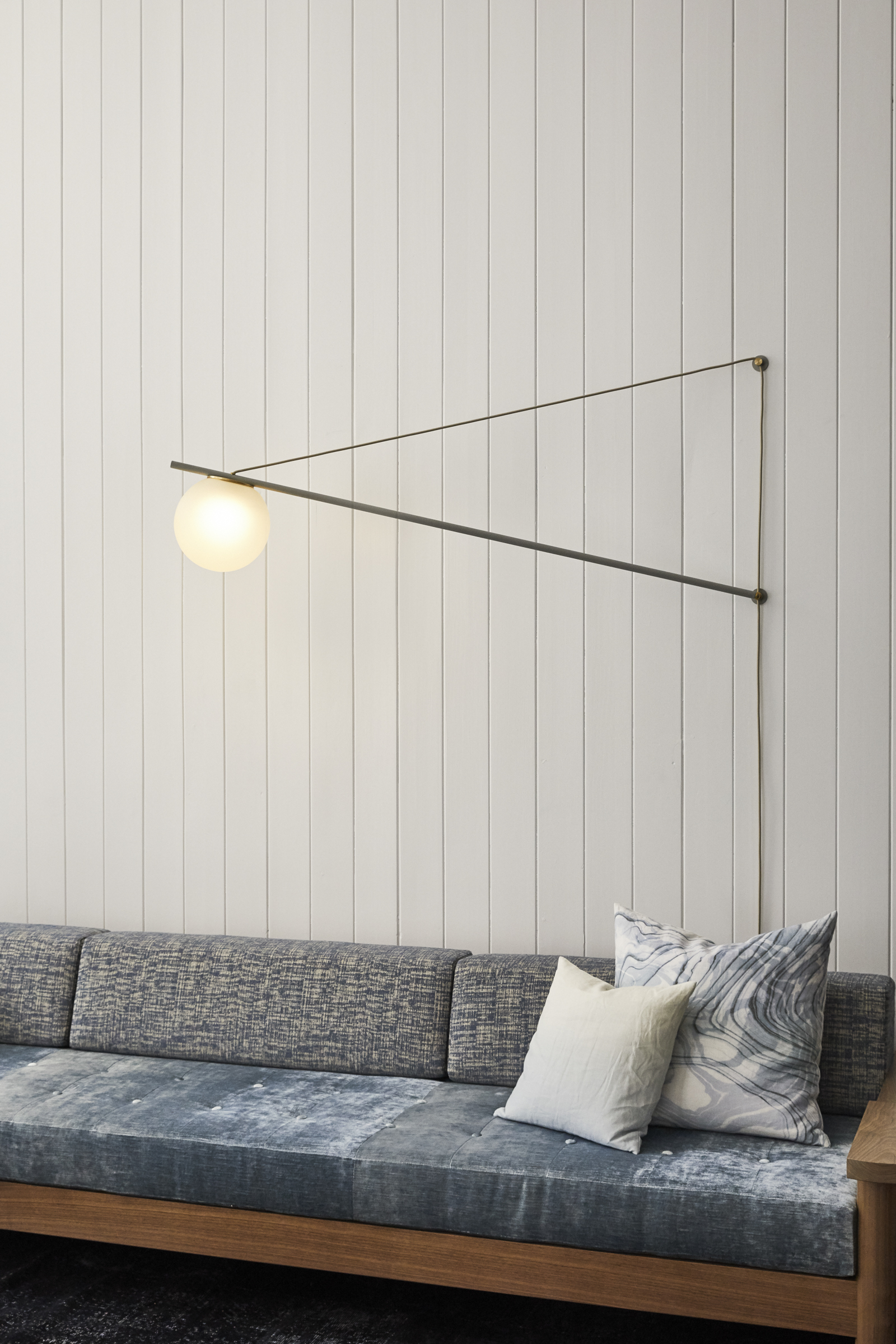
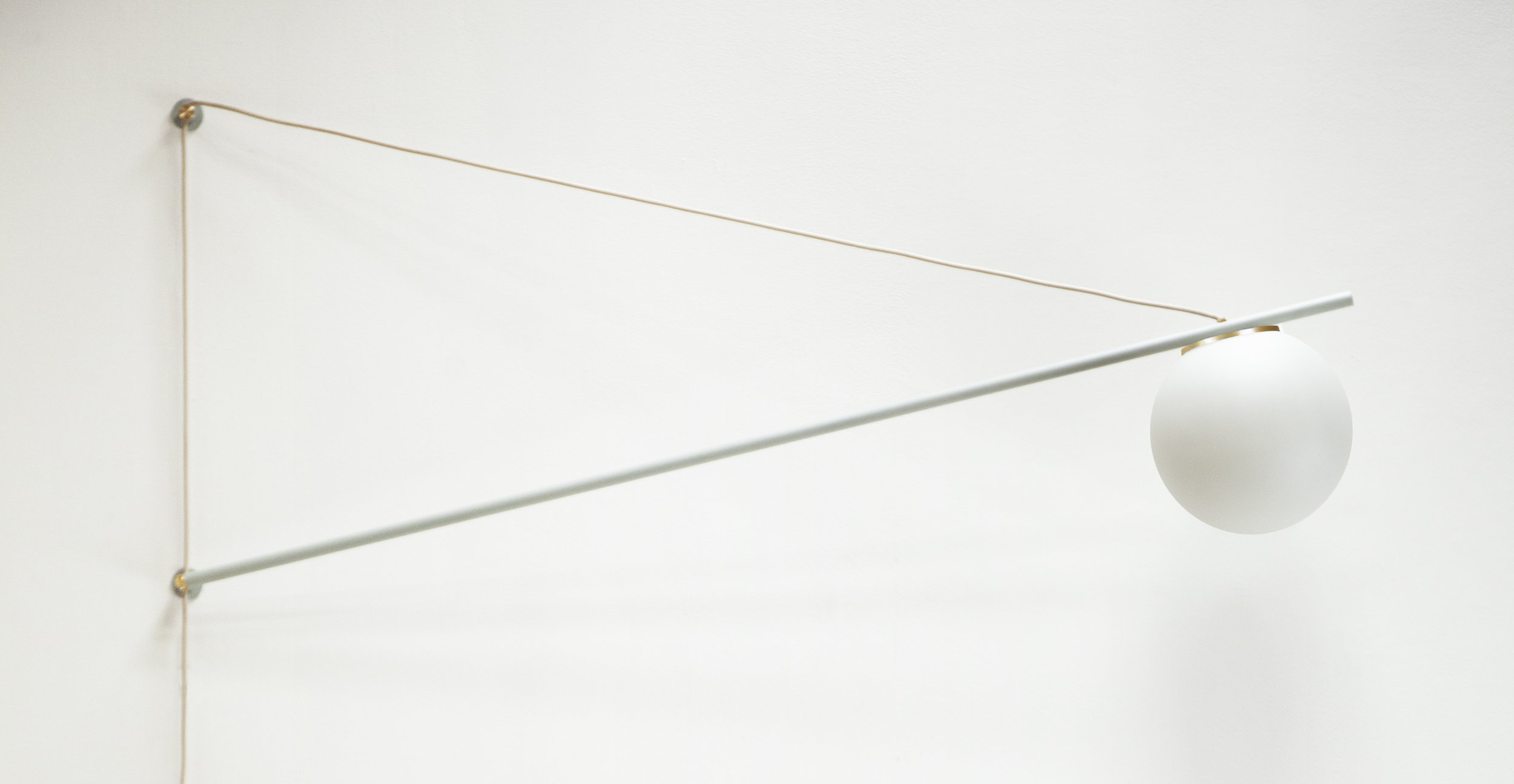
Addressing this challenge with three simple elements, Iso's single rotating armature elegantly cantilevers from the wall by the lamp's cord to strategically place a globe light source right where it needs to be. The result is an elemental sculpture of functionality in which each of the lamp's elements work together to define its use as well as its form.

Iso installs directly into a wall by two screw points and plugs directly into a wall outlet - eliminating the need for a dedicated junction box or need for an electrician. The arm's adjustable pivot allows the lamp to be positioned and repositioned as the use of a space evolves.

Available in two sizes, 60" and 30", Iso is suitable for installation over dining tables, sofas, or bedside.

A special selection of materials range from brass to tonal texture powder coats accented by a new selection of color-washed glass globes in a subtle yet elegant pearl-like finish.

Glass Globes.jpg

Get more information on Large Iso, and Small iso Swing arm lights for your next project!

Comment

Comment

L&G PRODUCT FEATURE - Shape Up

Space: Studio DB, Photo: Matthew Williams

In 2013, we began to think more deeply about how lighting can work in harmony with it's environment to create dynamic engaging spaces. 

We became fascinated by how common types of lamp shades direct light in ways that are at once functional, formal and atmospheric.  Basic ubiquitous shades - a glass globe, a metal cone, dome, etc resonated with us for their simple, elemental forms that expressed their functionality through their materials and shape.  Thinking about these as building blocks, we imagined collaged constellations of shades working in concert to respond harmoniously to a variety of spatial conditions.

The result was Shape Up, a versatile system of 5 shapes that can be networked together in response to their environment.  


SHape up GIF.gif


Shape Up also represents the beginning of an amazing partnership with Brooklyn lighting company Roll & Hill.  We were honored to be invited to design a product for the company at a time when our studio was discovering what we stood for.  In this way, the road to Shape Up was especially formative to developing our voice and vocabulary - we are so grateful to Roll & Hill for supporting that.  

To this day, Roll & Hill masterfully produces Shape Up to a quality level every designer dreams of.  We're beyond pleased to be working with them and able to offer these products to our clients directly with their amazing level of craft. 

aura moodboard 3.png
material inspirations for shape up .jpg

Shape Up is a modular system offered in many configurations from a 5 piece chandelier to single adjustable pendants to custom arrangements. 

We're here to help you configure a composition perfectly tailored to your space.

Email us at sales@ladiesandgentlemenstudio.com for help discovering how Shape Up can be a part of your next project.
 

Comment

Comment

L&G PRODUCT FEATURE - Aura

aura gif.gif

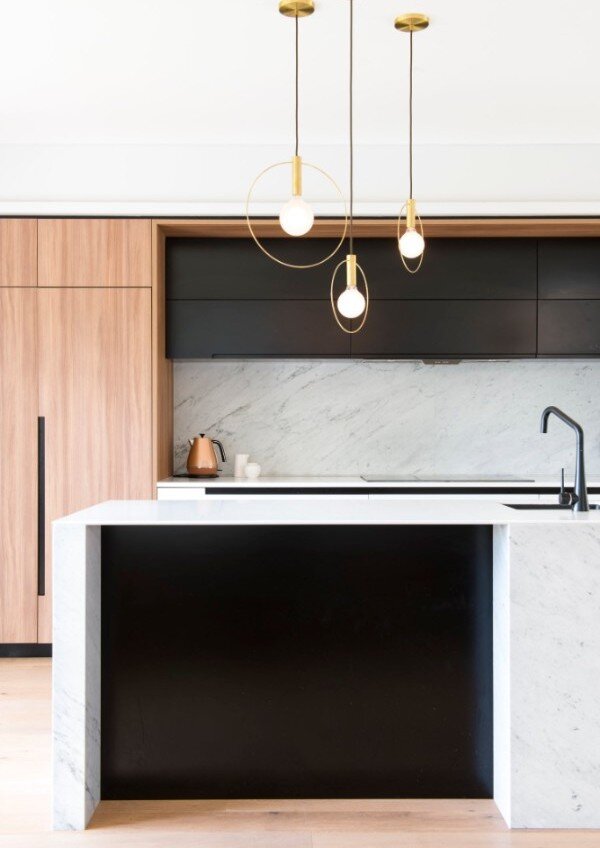
Today we explore a L&G 'classic' - the Aura Pendant, our very first lamp.   Created in 2012, it was designed as a pure expression of artificial light beginning with the light bulb as the essential unit.  From there, a simple gesture - the brass ring - highlights the act of illumination exposing a delicate glowing halo surrounding the luminaire. 

In our minds, nothing more was required to celebrate the wonder of modern lighting.
 

Product: Aura Cluster / Photo by: KAAREM

We believe our responsibility as designers is to celebrate the simple ingredients that make the mundane magnificent.  After all, the very idea of artificial light is a modern marvel we take for granted everyday.

Getting down to the essentials is the most challenging and rewarding part of design exploration.  We believe reductionism is one way to discover honest answers about an object's function, form, and soul.  Aura is a celebration of this approach as well as the beginning of our fascination with light, shadow, and texture began.

moodboard aura.png

The Aura collection is available in a variety of finishes and configurations from small pendants to large clusters.  Each provides simple lightweight solutions to accent surrounding spaces. 

Please click the links below to discover the full series.

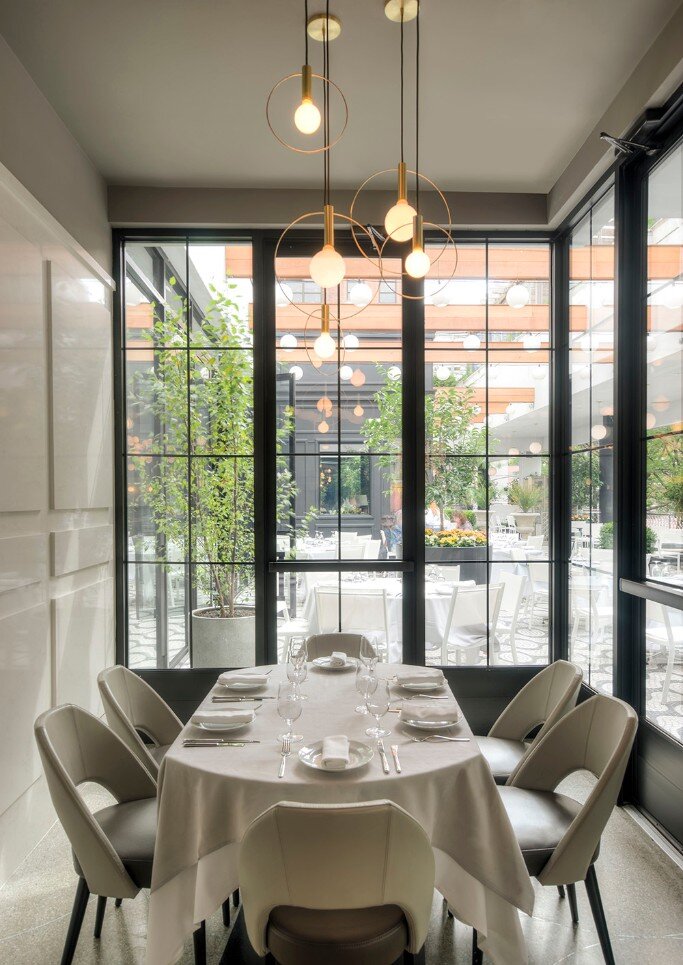
La Sirena restaurant by TPG Architecture

La Sirena restaurant by TPG Architecture

La Sirena restaurant by TPG Architecture / Kitchen by Minosa Design

Comment

Comment

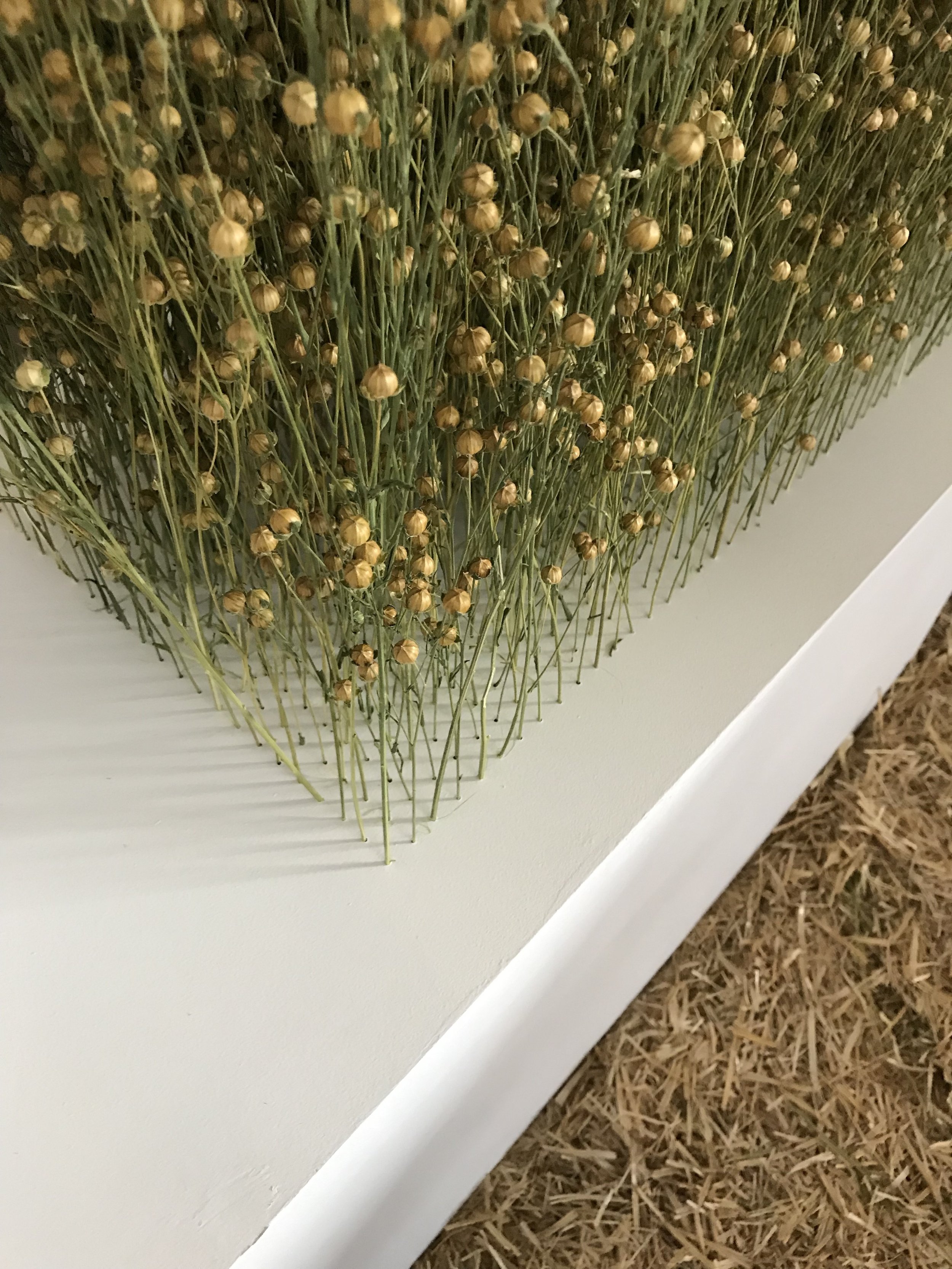
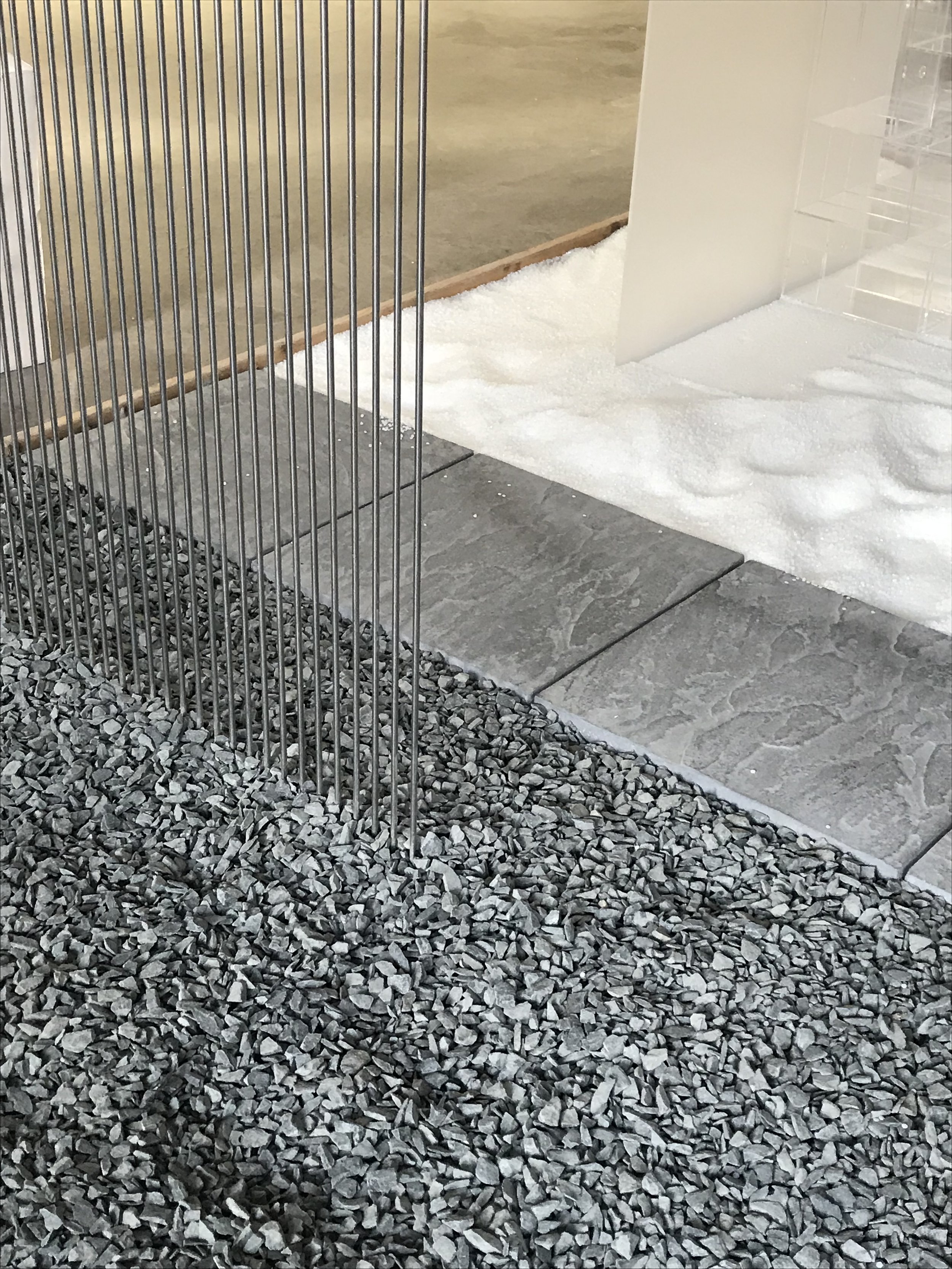
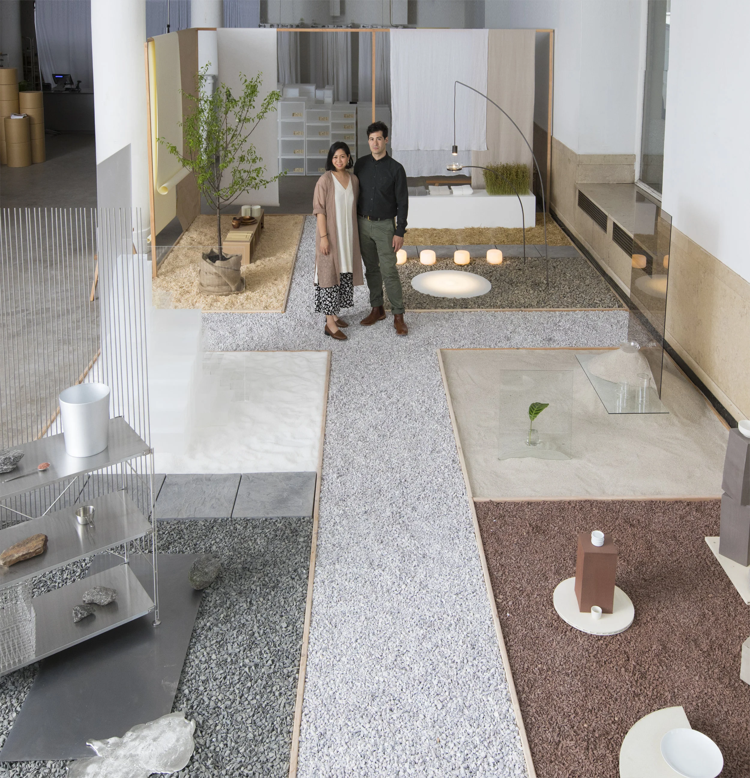
MUJI MATERIALS GARDEN - NY Design Week

From the very beginning of our design careers, MUJI has had a special place in our hearts.  Their honest approach to material, function, and lifestyle has always been an inspiring reference point for us.

This year's NY Design Week afforded us the ultimate honor of working with MUJI to create a special installation celebrating their 10 year anniversary in the US.  

For the

_Q2C9573.jpg

Taking the form of a landscaped garden, MUJI Materials Garden featured a series of vignettes curating selections of  MUJI’s products composed with their raw source materials.

Evoking the curiosity of a garden stroll, the landscape explored the genuine origins of the products while conjuring our Visual Stories series, our on-going photo journal of compelling material compositions found in our travels and everyday life.  We imagined an experience that shares our fascination with materials - a passion we share with MUJI.

CONCEPT ILLUSTRATIONS-01.png
process.png
_Q2C9378.jpg

A haptic stone pathway connected each garden vignette, encouraging visitors to ponder MUJI products in a new context by wandering, exploring, and discovering the inherent beauty of the materials they originate from.

While diverse and broad MUJI's range of products is connected by their materiality and thoughtfulness.   We aimed to reflect this in the landscape by carefully juxtaposing the materials with minimal styling or finishing - letting the spirit of each material qualities speak for themselves.

_Q2C9530.jpg

While researching the installation, we studied the material origins of MUJI’s most popular products, finding moments of natural beauty in each ingredient.   The process was marked by binge watching 'How it's Made' videos, exciting field trips, and hands-on ideation. 

We were overjoyed to see visitors expressing similar curiosity...

_Q2C9493.jpg
_Q2C9455.jpg
_Q2C9596.jpg
_Q2C9553.jpg

Every year, we take NY Design Week as an opportunity to push the boundaries that define our studio. Our ongoing exploration of materiality is at the heart of everything we do at Ladies & Gentlemen Studio be it products, sculpture, environments or design experiences.

Big thanks to MUJI for an unforgettable experience!

_Q2C9687.jpg

Comment

Comment

L&G Showings around Milan for Salone del Mobile 2017

It seems like only yesterday since we went to Milan for Salone Del Mobile 2015 when we launched our SHAPE UP lights and was invited to be part of Wallpaper*Handmade.  

We're thrilled to share the news that we're heading back again to Milan this year for Salone del Mobile and will be showing at various locations featuring L&G works selected by a mix of brands we admire. See below for more info on the L&G showings in 3 locations this year. 


SP01 + ARCHIPRODUCTS  
Via Tortona 31, Milan
Hours: 9-18 (4/4-4/7), 9-15 (4/8)


Roll & Hill 4/4 - 4/9
Salone del Milano - Rho Fiera
EUROLUCE section / Hall 13, F11
Hours: 10-18


Poliform 4/4 - 4/9
Salone del Milano - Rho Fiera /
PAVILION 5, STAND: A09.B02 A11.B10
Hours: 10-18  

Comment