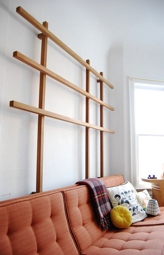
Our livingroom on Apartment Therapy Blog!!
 So it has been a super exciting week for L&G, because not only did Jan from the Poppytalk Blog write a nice entry about our living room display, but Apartment Therapy (Chicago) also used it as an example for a display idea! I was floored when Jan passed that information to me! Thanks Jan!
There's been several comments and inquiries about the couch and here's a little info about it! The couch is a Knoll couch with a parallel bar base that Dylan scored on Craig's List (for a mere $125...they didn't know what they had!). It was originally a couch in the Seattle Public Library and was covered in hideous brown naugahide.....eew, I know. We had to get it reupholstered and chose a Knoll fabric called Alignment in blood orange. We were able to get for cheap on Ebay for only $9.00/yd. I love Ebay.....and Craig's list. Those curious about the display grid: The grid is easy to construct with standard 2 x 2's from a local lumber store (they're actually 1.5" x 1.5"). We chose cedar because we liked the color and consistency. So here are the steps...pretty simple, but the main thing is that there aren't any visible fasteners.
- Lay out the grid's verticals according to wall stud locations maintaining asymmetric spacing. The horizontal elements are arranged according to the desired height of shelves and prints.
- Set the grid up on the floor and screw it together from the back.
- To attach to the wall, we cut 4 short blocks of 2x2 down to about 1 1/2". Screwed each of these to the wall at a stud from the end to align with the grid.
- Use L-brackets to attach the grid to the blocks...because of the height of these, the brackets are hidden from view.
- Shallow shelves (up to 8" deep) can be cut to the width of each bay and screwed down from the top with nice looking screws (screwing down is much stronger than upwards from the bottom).
- Decorate & Enjoy!